By Catherine Austin Fitts
My “go to” website for technical analysis of precious metals, the US dollar & the US stock market is Rambus Chartology, where Rambus (that’s his handle – he’s the founding technical analyst) leads a discussion with extensive charts of what the markets are saying.
In January 2016, Rambus launched his quarterly Solari Report with a Blockbuster Chartology. You can find links to the entire series of quarterly and annual Blockbuster Chartologies at the end this latest piece.
One of the reasons that Rambus is so good at his craft is that he focuses on “staying on the right side of the major trend.” The challenge of doing so at this time is that it is tempting to look for bottoms or to assume that the trend upwards in the US dollar or stock market may be over. However, Rambus consistently brings us back to the discipline of the Chartology. What does price tell us? As he describes so aptly, we are dealing with psychological warfare.
Sitting back once each quarter to get this perspective offers invaluable insight. So, here we go for the 1st Quarter 2019 Blockbuster Chartology!
Blockbuster Chartology Quarterly Report
By Rambus
~ 1st Quarter 2019 Wrap Up ~
- Quarterly Report Part 1 : U.S. Stocks : The Devil is in the Details
- Quarterly Report Part 2 : World Stock Markets Poised
- Quarterly Report Part 3… Stock Market Illusion
- Quarterly Report Part 4… Commodities
- Quarterly Report Part 5… The Precious Metals Complex
Quarterly Report Part 1 : U.S. Stocks : The Devil is in the Details
Every three months I do a Quarterly Report for Catherine Austin Fitts who is the founder of the Solari Report. It’s a lot of work but it forces me to look at all the different markets from a fresh perspective each quarter. Getting the big picture correct helps guide us in what direction to trade as it’s always much easier to invest in the direction of the big trend. There is nothing more frustrating than shorting a bull market or going long in a bear market unless you can pick the exact top and bottom. It’s that proverbial, Salmon swimming up upstream analogy. They finally make it to their spawning grounds after many obstacles along the way but they are completely wore out and die giving life to their new offspring.
Since this past Friday marked the end of the month and the end of the quarter trading for the markets lets begin by looking at some stock markets from around the world starting with some US stock markets. A little over a year ago the US stock markets topped out in January of 2018 and corrected for the entire year putting in what appears to be an important low on Christmas Eve. Several big questions swirling around the investment community are, was the December 24th low the first shot across the bow in a new bear market, with the current rally being the first bear market rally that will rollover and make new lows? The second question asked, was the December 24th low the bottom of the next consolidation phase within the secular bull market that began in 2009 with new all time highs coming in the future? Lets look at some long term charts objectively so we can see if they can offer any clues on what the big trend may be.
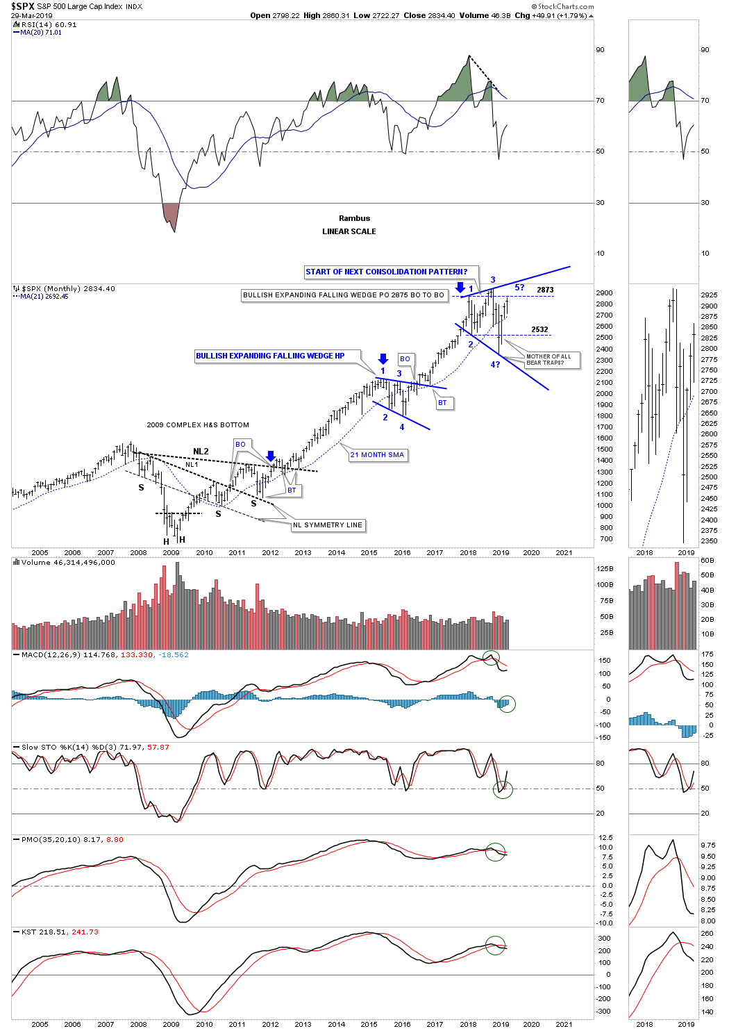
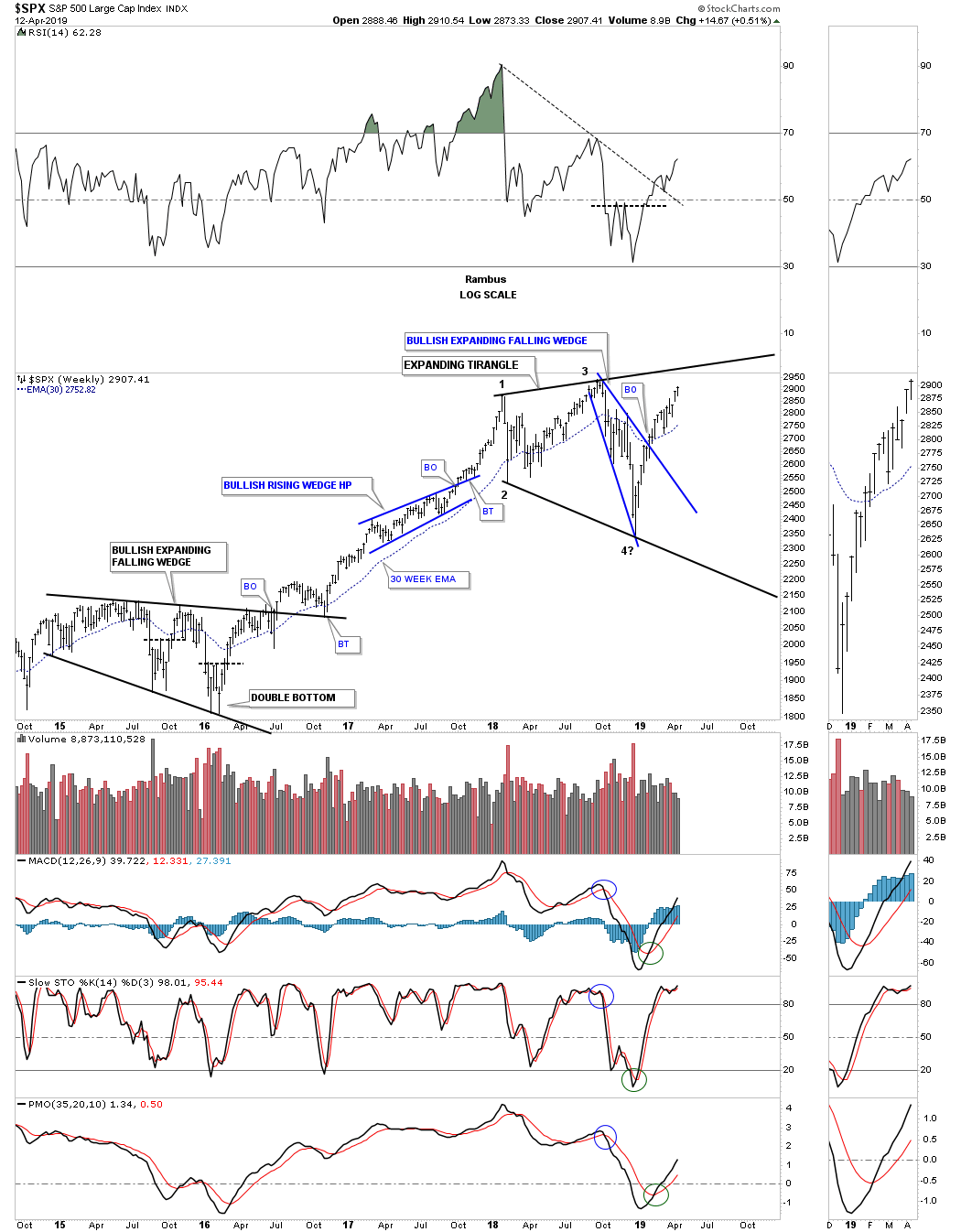
Lets start with a 15 year monthly chart for the SPX that shows its 2009 bull market. I’m going to go into some detail using this monthly chart so we can use this chart as somewhat of a proxy for many of the other index charts to follow. On this 15 year linear scale chart we can see the massive complex H&S bottom that formed the 2009 crash low. The left shoulder encompasses that last portion of chopping action that led to the 2009 bear market low. As you can see the real crash only last a couple of months before the initial low was made, marked by the left head of the double headed complex H&S bottom. The SPX then had a strong bounce that lasted just one month before rolling back over to put in the second head which actually created a double bottom with that low being 666. As always , the devil is in the details.
From the depths of despair in 2009 sprang to life one of the greatest bull markets of all time which has confounded the experts since its beginning. How could we have one of the greatest bull markets of all time when the world was on the brink of a financial collapse similar to 1929? If one tries to analyze the 2009 bull market from a fundamental perspective this bull market makes no sense whatsoever and never will. But if one analyzes the 2009 bull market from a Chartology perspective it has made perfect sense. The fundamentals are all wrapped up in the price action and what investors are actually doing with their capital.
The dominate feature on this long term monthly chart is the size of that massive H&S bottom which took four years to complete. I know I sound like a broken record when I say this but, “big patterns lead to big moves.” Our current secular bull market couldn’t have the staying power if the reversal pattern wasn’t big enough to sustain such a big move. Note how nicely the price action is in regards to the neckline symmetry line which shows the low for H&S #1 and the breaking out and backtesting of neckline #1 and neckline #2.
After the last backtest to neckline #2 the first impulse move up began and carried the SPX up to the first reversal point in the blue expanding falling wedge labeled #1. From that point began the first consolidation phase that was needed for the SPX to consolidate its gains. After completing its fourth reversal point in February of 2016 the second impulse move up began that lasted two full years that ended in January of 2018. Since that high the SPX has been chopping sideways in what I believe is going to be another consolidation pattern in the ongoing secular bull market. The 2018 trading range is still incomplete because we don’t have a breakout of the top rail of the blue expanding triangle. It’s possible that the price action could still morph into a diamond when all is said and done. The blue thin dashed horizontal lines show you the heart of the trading range where the all important 4th reversal point is about to be put in place. which is the minimum of reversal points we need to see for a consolidation pattern.
The last feature I would like to show you on this chart is why the bullish expanding falling wedge is labeled a halfway pattern. If you take the distance from the breakout point on neckline #2, blue arrow, and then measure up to the first reversal point in the blue expanding falling wedge then add that distance to the breakout point on the bullish expanding falling wedge you get a price objective up to 2875 which is very close to the 2018 high, thus a halfway pattern between two impulse legs on a linear scale chart.
Next lets go back further in time and look at a 25 year monthly chart for the SPX which shows you another reason why I believe the secular bull market still has room to run. From the 2000 top which was the end of the previous secular bull market that began some 20 years earlier the SPX chopped out a massive 13 year flat top expanding triangle consolidation pattern. It took that long to consolidate the previous secular bull market. In the spring of 2013 the SPX broke out of that massive consolation pattern and began its first Impulse leg up which ended with the 2016 bullish expanding falling wedge halfway pattern that we just looked at on the chart above. Once that consolidation pattern finished building out the next impulse move took off to the upside and ended in January of 2018 where we currently find ourselves consolidating the previous impulse leg.
What this chart shows you are the three of the main principals of Chartology. A stock does only one of three things. It is either building out a reversal pattern, a consolidation pattern or is in an impulse move. Since the SPX has been trading sideways since the 2018 high we know that it’s either building out a consolidation pattern that will breakout to the upside or this trading range is going to end up being a reversal pattern of some kind. There are only two options. Since the bull market is still intact from the 2009 low the odds favor a continuation of the bull market, but if the price action breaks to the downside then I’ll be the first person to declare the secular bull market has run its course and is dead and a new bear market has begun. At this point in time from a Chartology perspective there isn’t enough evidence to declare the 2009 bull market over. Maybe the fundamentalist can make a case for a new bear market but they have been wrong for a long time and like a stopped clock that is right twice a day they could be right this time around. As always time will tell.
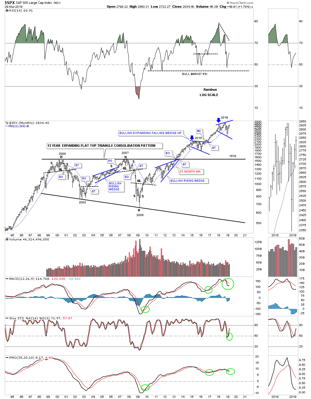
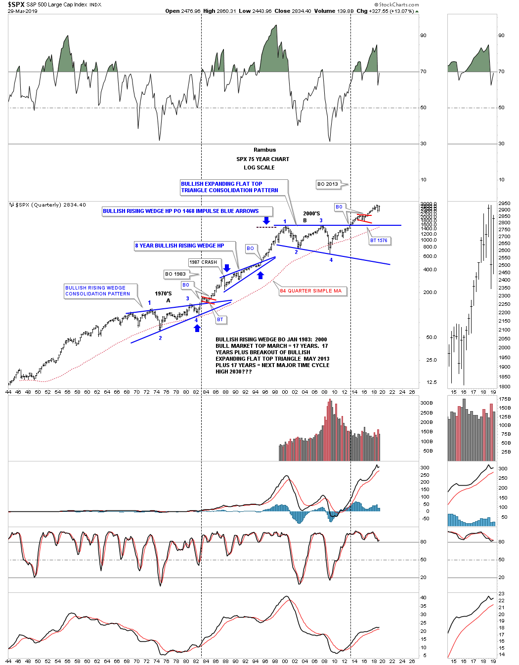
This last chart I would like to show you for the SPX is a very long term 75 year look at the price action going all the way back to the mid 1940’s. Again using the basic principles of Chartology you can see the massive 1970’s bullish rising wedge consolidation pattern that launched the previous secular bull market that ended in 2000. Note the blue eight year bullish rising wedge which formed as a halfway pattern as shown by the blue arrows.
Then we have the 2013 flat top expanding triangle that consolidated the previous secular bull market and launched our current secular bull market with the breakout above the top rail of the flat top expanding falling wedge in 2013. It has now been six years later and the SPX is on the verge of making a new all time high regardless of all the reasons it shouldn’t be.
There is one more simple aspect of Chartology that shows up very clearly on this 75 year chart. Once an impulse move begins, the price action between the consolidation patterns makes a series of higher highs and higher low which is easy to see. If the SPX takes out the December 24th Christmas Eve low that would be a strong indication the bull market is over but until then the preponderance of evidence from a Chartology perspective is that the secular bull market that began in 2009 is alive and well. In the top right hand corner of the chart you can see what the SPX did for the first quarter of 2019.
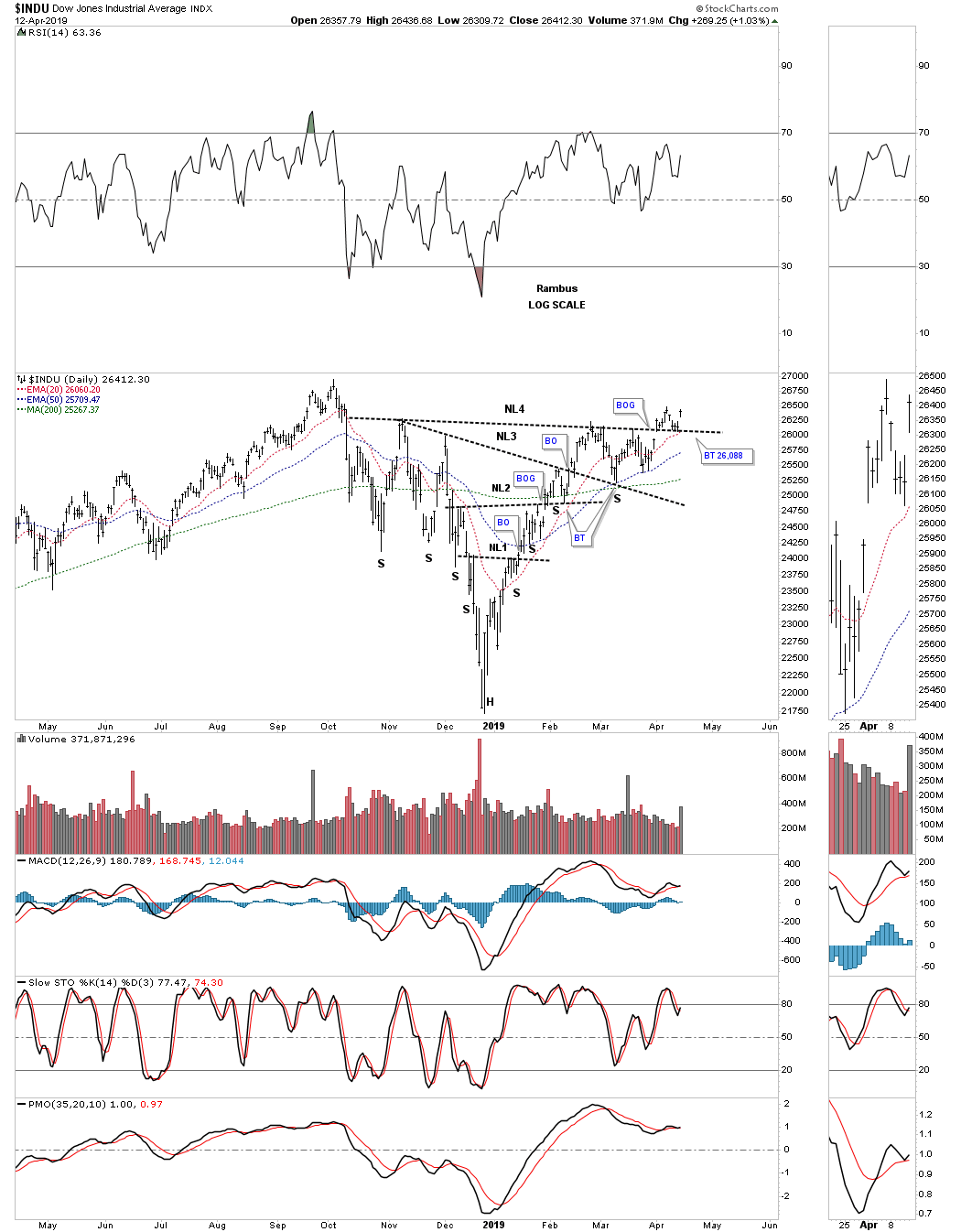
Now that you can see what the Chartology is strongly suggesting for the SPX lets look at some other US stock market indexes using the SPX as a proxy. For several years I’ve been labeling this monthly chart for the INDU as the most hated bull market in history. Again, you can see the complex H&S bottom that has led to our current secular bull market.
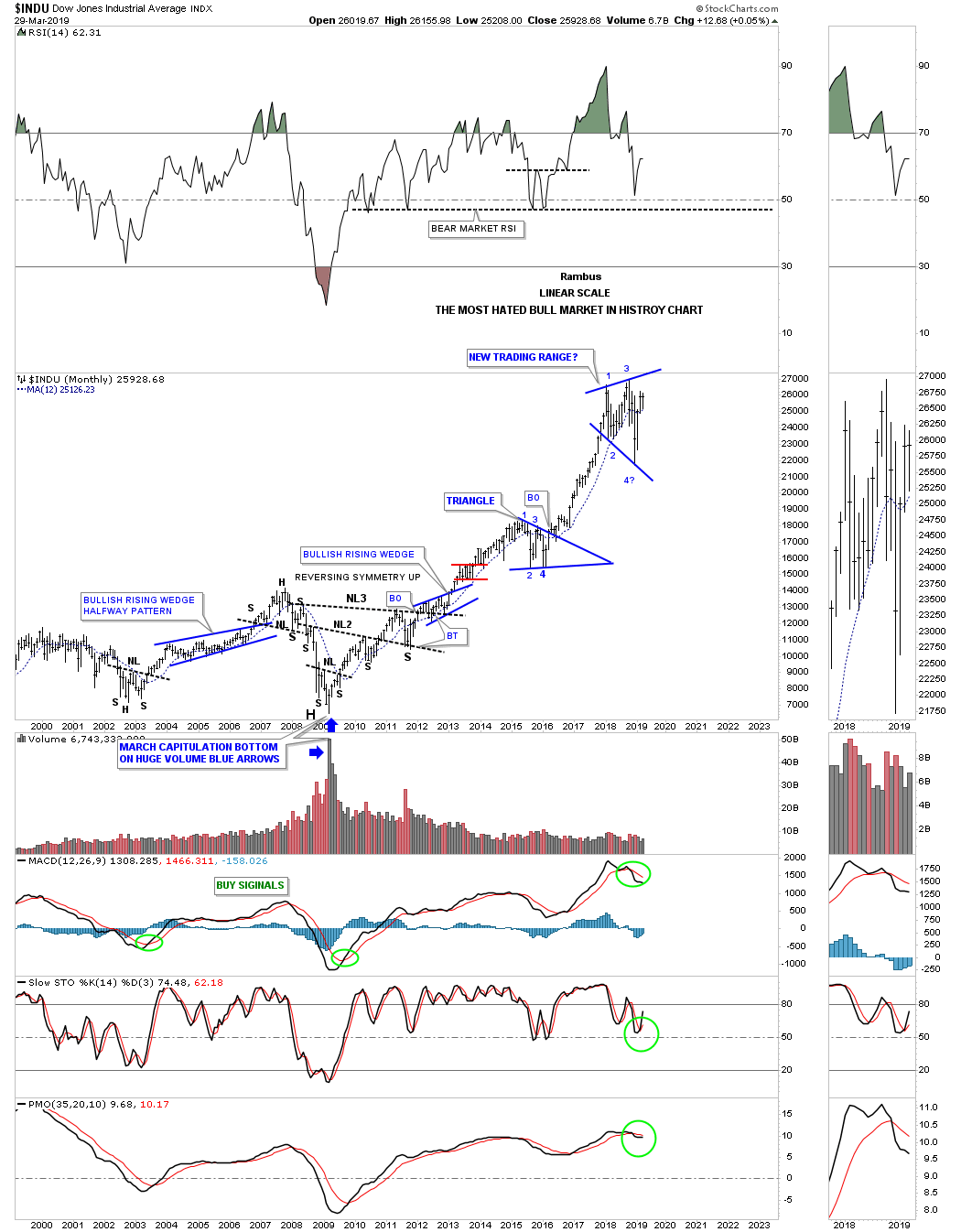
Below is the infamous, Jaws of Life pattern that we followed from the breakout in 2013 with that long drawn out backtest that took nearly three years to complete, unlike the SPX which only took several months. Recognizing large patterns early on in their development can be torturous at times. You see the pattern, then you have to wait for the breakout and in the case of the INDU the backtest seemed like it would never end. The backtest finally ended with the formation of the blue triangle that formed on the top rail which led to the 2016 – 2018 impulse move.
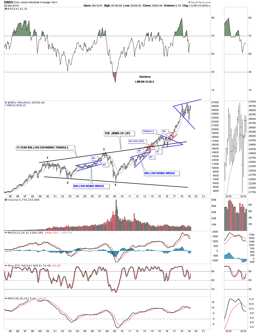
This next chart for the INDU is a 40 year quarterly line chart which I’ve labeled the “Jaws of Life” as a halfway pattern to the upside. Starting at the 1980 low you can see the INDU never made a lower low or lower high during that secular bull market that ended in 2000. Our current secular bull market that began in 2009 has also made a series of higher highs and higher lows which is the definition of an uptrend. Three months from now when we look at this quarterly line chart will we see a higher high or a lower low?
This last chart for the INDU is a 75 year quarterly chart which shows the 1970’s H&S consolidation pattern and the secular bull market that ensued after the neckline was broken. I know some of you were not around during the 1987 crash that literally felt like the end of the world, but when you see it on this long term chart it was just a blimp that began the multi year bullish rising wedge which formed at the halfway point in that secular bull market. Now we can fast forward to the 13 year “Jaws of Life” consolidation pattern. Note how similar the breakout and backtesting process was to the 1970’s H&S consolidation pattern neckline, and the 2000’s top rail of the expanding triangle. The 2000’s Jaws of Life backtest took longer to complete but it was those backtests that confirmed those massive consolidation patterns which launched their respective secular bull markets.
The Transportation Average built out a massive seven year H&S consolidation pattern with the head forming at the 2009 crash low. During the 2015 correction it built out another H&S consolation pattern which brings us up to the present.
![]()
Below is the 100 year quarterly chart with its major consolidation patterns that have formed. You can see how nicely the seven year H&S consolidation pattern fits into the big picture. The Transportation Average actually did a bit better than the INDU as it was up over 13% since the first of the year.
![]()
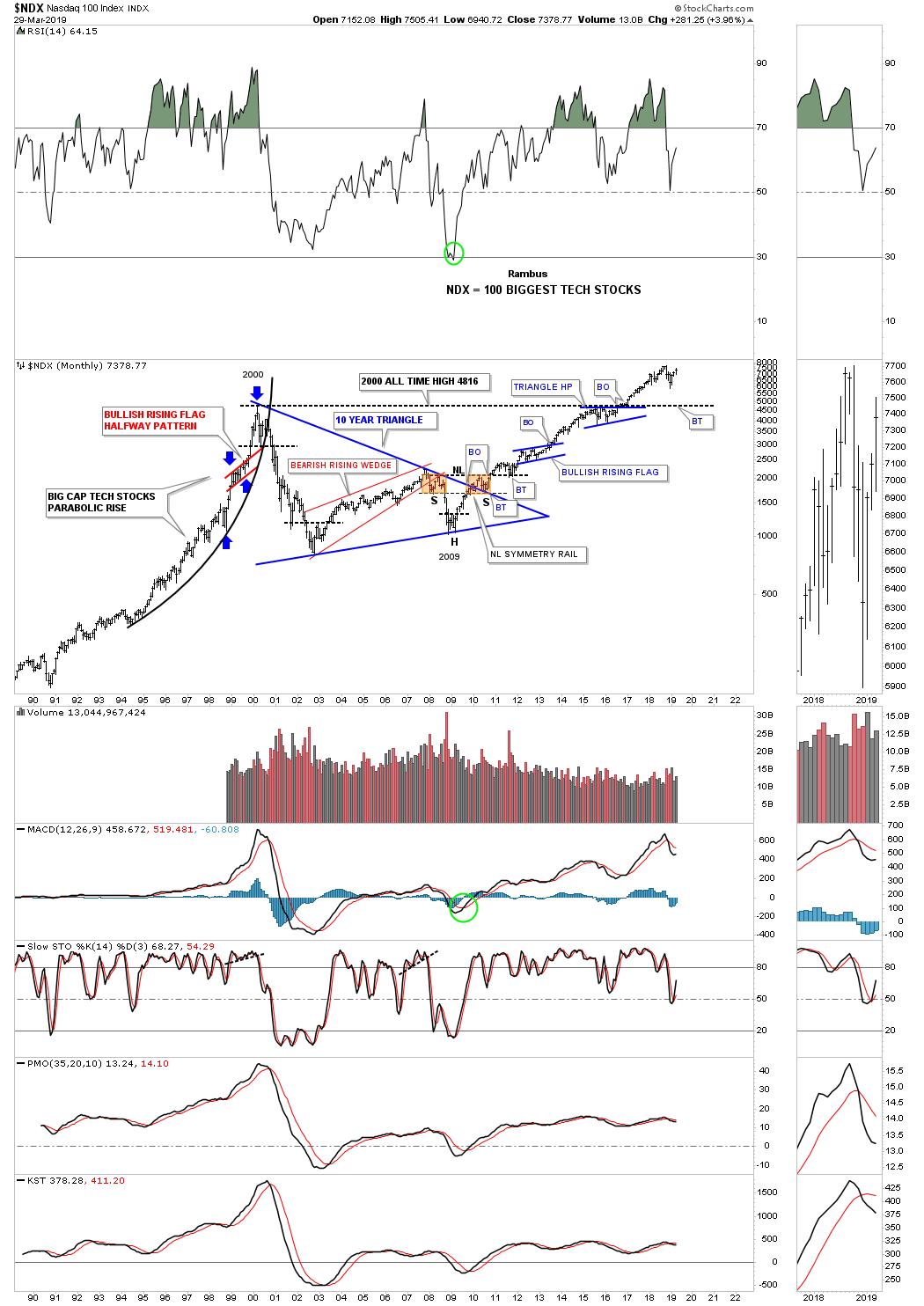
Next lets look at the long term monthly chart for the $NDX 100 which has produced some beautiful Chartology through the years starting with the parabolic blowoff phase that began in 1995. Note the small red bullish rising flag that formed in the middle of that parabolic run into the 2000 high as shown by the blue arrows. From that 2000 secular bull market high it took ten years to correct that massive bull market with the NDX building out the ten year blue triangle consolidation pattern with the very symmetrical H&S bottom at the last reversal point. That H&S bottom was a classic as the left shoulder and head formed inside the triangle with the right shoulder low forming on the backtest to the top rail of that ten year triangle. Unlike the SPX and the INDU that broke out of their massive 13 year consolidation pattern in 2013 the NDX didn’t breakout to a new all time high until earlier in 2017. A big clue that the NDX 100 was going to finally rally to new all time highs is when the blue triangle, that formed just below the all time high trendline at 4816, broke out to the upside.
The $RUT 2000 small caps index, is setup a bit differently than most of the other US stock markets. Since its 2000 bulll market high it has been building out an 18 year bullish expanding rising wedge formation. The breakout above the top rail occurred in July of 2017 which looked normal at the time. As you can see during the last quarter of 2018 the price action broke down below the top rail signaling a possible false breakout. This past quarter the RUT has rallied back up to the top rail. By the end of the next quarter we should know if there was a false breakout below the top rail or did we just witness a bear trap, red circle?

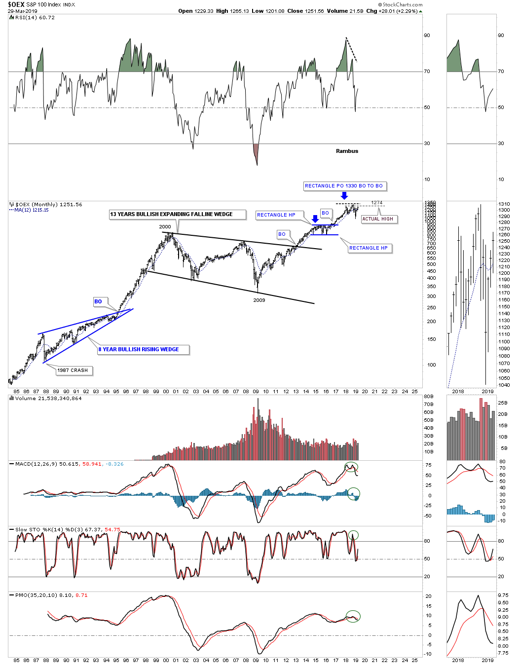
This next long term chart is the OEX 100 I used to trade options on in the old days when they were still listed as fractions. It formed a 13 year bullish expanding falling wedge during the 2000’s which led to its new secular bull market beginning in 2009. It has been consolidating its recent impulse leg up since the 2018 high.
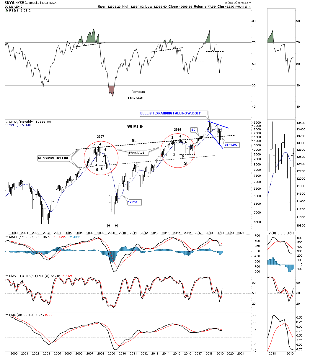
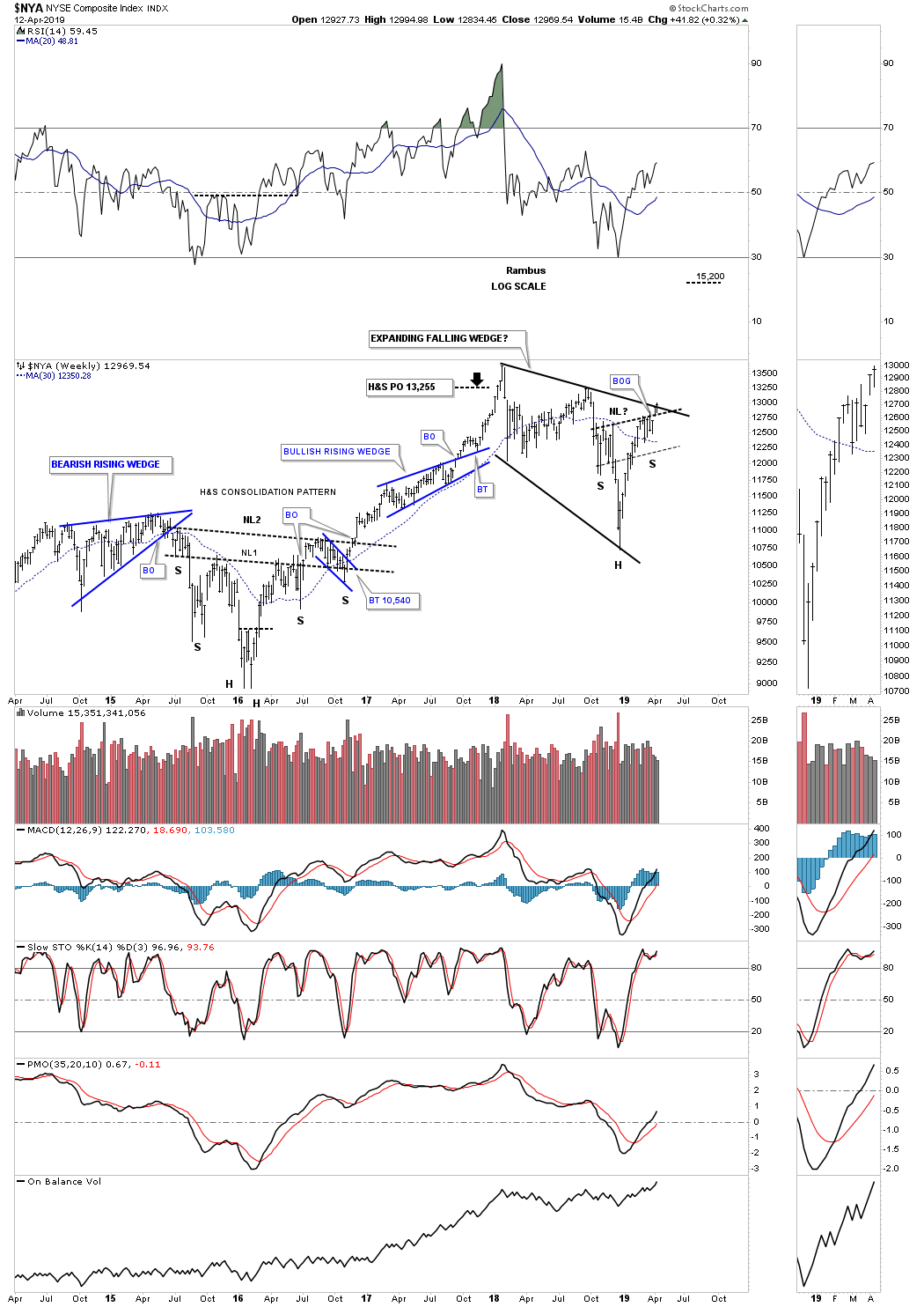
This last chart for tonight is a long term 25 year monthly chart for the $NYA which is a broad measure for US stocks. This index is setup completely different than the other US stock market indexes we’ve looked at tonight. First note how much higher the 2007 high is vs the 2000 high. It didn’t even begin to consolidate until the first reversal point in 2007 which built out a ten year bullish rising wedge. The breakout didn’t occur until June of 2017 when the price action began to immediately form the blue bullish expanding falling wedge as the backtest. As you can see the NYA cracked below the apex of the ten year bullish rising wedge but reversed course and has now closed back above the apex to avoid an end around move.
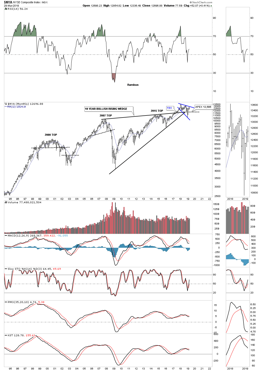
There are several large patterns that I’m fond of right now when it comes to the US stock market indexes but this very large H&S bottom is one of my favorite patterns right now. I began showing you this potential H&S bottom back in 2016 when the left and right shoulder fractals fell apart at the very last second. The two fractals were perfect right up until the right shoulder low failed to close below the neckline symmetry line just below reversal point #5. Once the failure became apparent I drew in the neckline to see if it may work. The breakout occurred in February of 2017 with the backtest to the neckline forming the blue expanding falling wedge. The December 2018 spike low completed the backtest to the neckline which was a little strong but now looks good. I believe the bullish expanding falling wedge will be our first really good clue that the rest of the US stock markets will be close behind in the resumptions of their respective impulse move higher.
This concludes the first part of the Quarterly Report. I will be posting many more long term charts over the next week or so. All the best…Rambus
Quarterly Report Part 2 : World Stock Markets Poised
In part two of the Quarterly Report I’m going to update some long term charts for some of the world stock markets. As you will see many have formed massive ten plus year consolidation patterns similar of what we observed in the first installment of the Quarterly Report which are similar in duration to many of the US stock markets. It’s these big multi year consolidation patterns that are strongly suggesting to us that the world as we know it is not coming to an end as so many analysis would like us to believe. For whatever reasons bear market news tends to grab investors attention much more so than bullish news. It has to work that way because if everyone was bullish, that comes at the end of a bull market, there would be no one left to buy. I’ve often said that, “investing in the markets is psychological warfare more than anything else.”
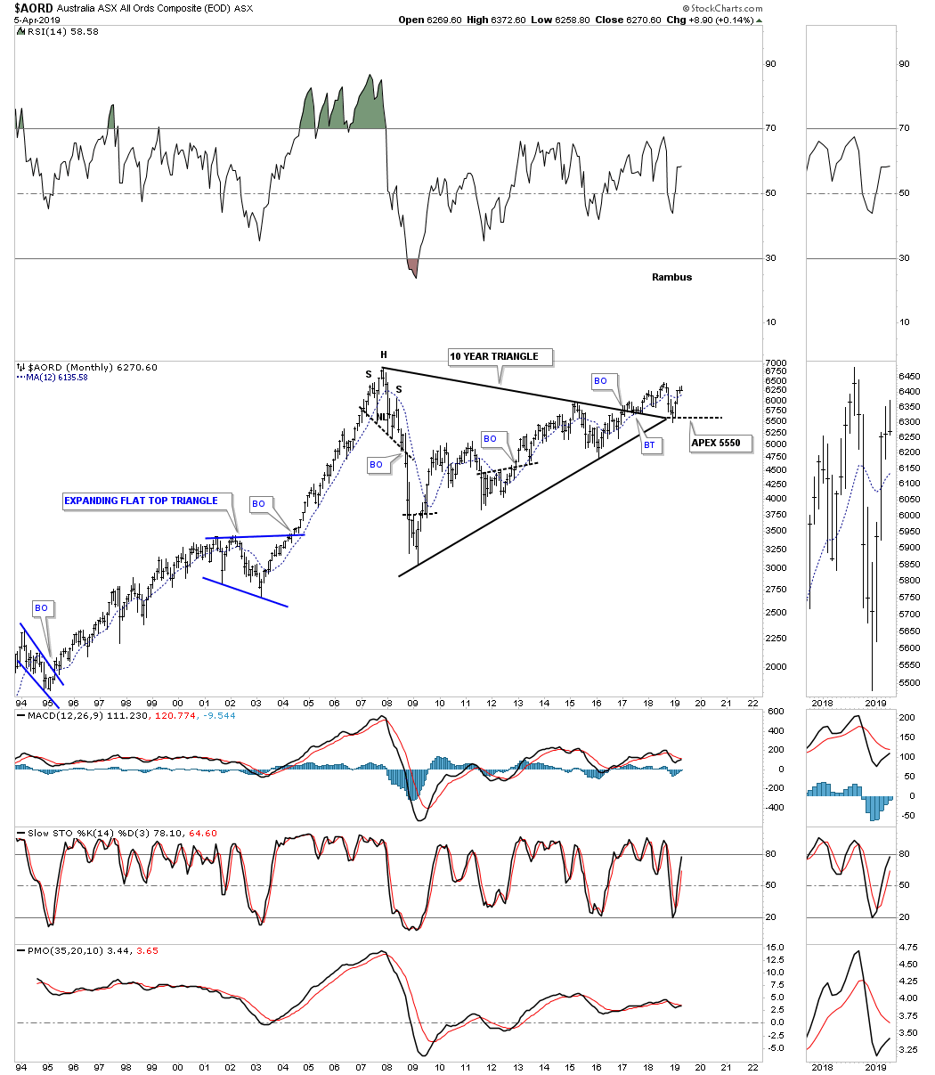
Lets get started by looking at the $AORD, Australian stock market, which built out a ten year triangle consolidation pattern. The top rail was broken to the upside in early 2017 with a small rally and now a strong backtest which found support at the last possible point which is the apex where the top and bottom rails intersect. A move below the apex would be an end around move which would have bearish implications, but until then the bull market remains in place.
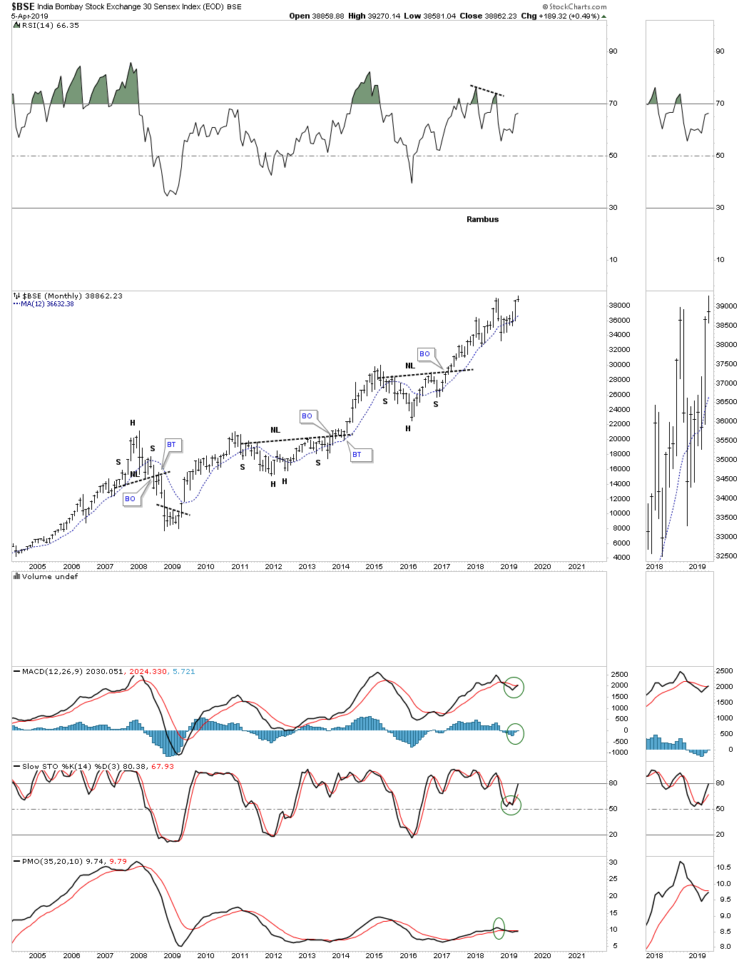
The $BSE, India Bombay stock market, has held up very well and is just a few of the markets that are testing their all time highs. It’s like the energizer bunny that just keeps on going and going.
This next world stock market is the $BVSP, Brazilian Stock market, which is one of the strongest in the world right now after completing a perfect breakout and backtest to the top rail of its ten year triangle consolation pattern.

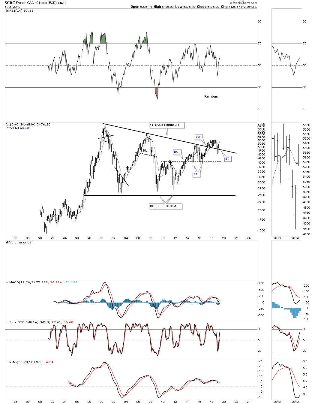
The $CAC, French stock market, is still in the breaking out and backtesting process. The strong backtest was nullified when the price action traded back above the top rail of its 17 year triangle consolidation pattern.
The $DAX, German stock market, broke out from its massive 12 year triangle consolation pattern around the same time many of the US stocks markets in 2013. It’s currently working on a multi year rising wedge formation that is forming above the top rail of its 12 year triangle consolidation pattern which is generally a bullish setup, but won’t be confirmed until the top rail is broken.

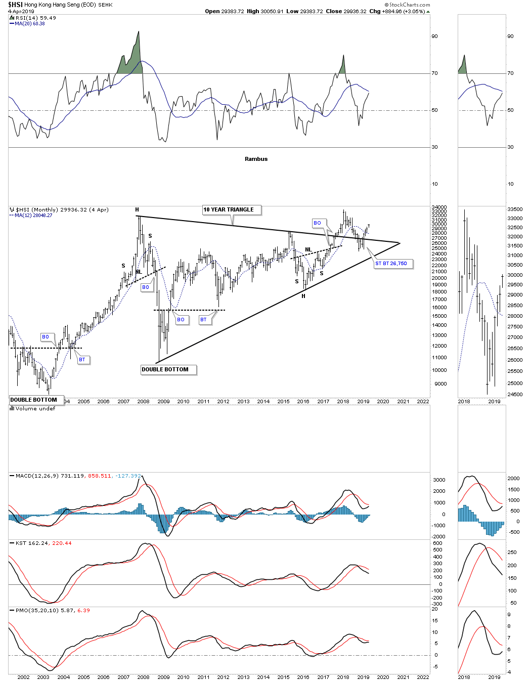
The $HSI, Hong Kong stock market, shows a similar setup to many of the stocks markets from around the world. It has formed a ten year triangle consolidation pattern with a strong backtest to the top rail that occurred late last year when the US and other world stock markets experienced the Christmas Eve shakeout move.
The $NIKK, Nikkei stock market, is one of the most important stock markets in the world so it’s always a good to see what it’s doing. The $NIKK originally topped out in the middle of 2015, but has been trading sideways and is building out a rising wedge formation. Note the backtest to the 2016 H&S bottom neckline which showed me a place to draw in the bottom rail of the rising wedge. Most will view the rising wedge as a bearish rising wedge but I’l reserve judgment until I see which trendline gives way. Note the smaller blue bullish rising wedge which formed just below the bigger one.

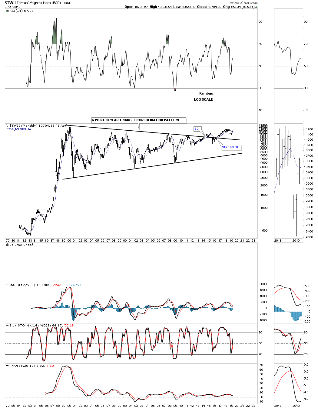
Next is the $TWII, Taiwan stock market, that has built out one of the longest running consolidation patterns I’ve ever seen which took 30 years to complete. The breakout above the top rail finally took place in May of 2014 with a fairly strong backtest to the top rail doing its job of holding support.
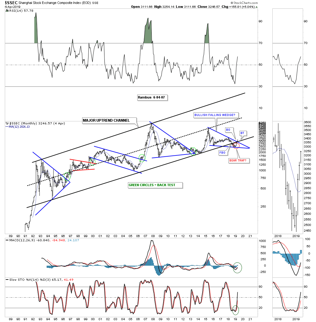
Another very important world stock market is the $SSEC, Shanghai stock exchange, which has been one of the weaker stock markets, but may be turning the corner. This long term monthly chart shows the major uptrend channel the SSEC has been in since the early 1990’s when it was new to the global scene. When it gets ready to move it doesn’t waste much time. This stock market index like so many we’ve looked at had a false breakout below the bottom rail of its major bull market uptrend channel in late 2018 which now appears to be another false breakout or bear trap. This month the price action closed above the top rail of the blue bullish falling wedge which completely changes the negativity this index has received. Normally when you see a false breakout or bear trap and price action reverses back up to negate the false breakout, you can get a stronger move in the opposite direction and in this case up.
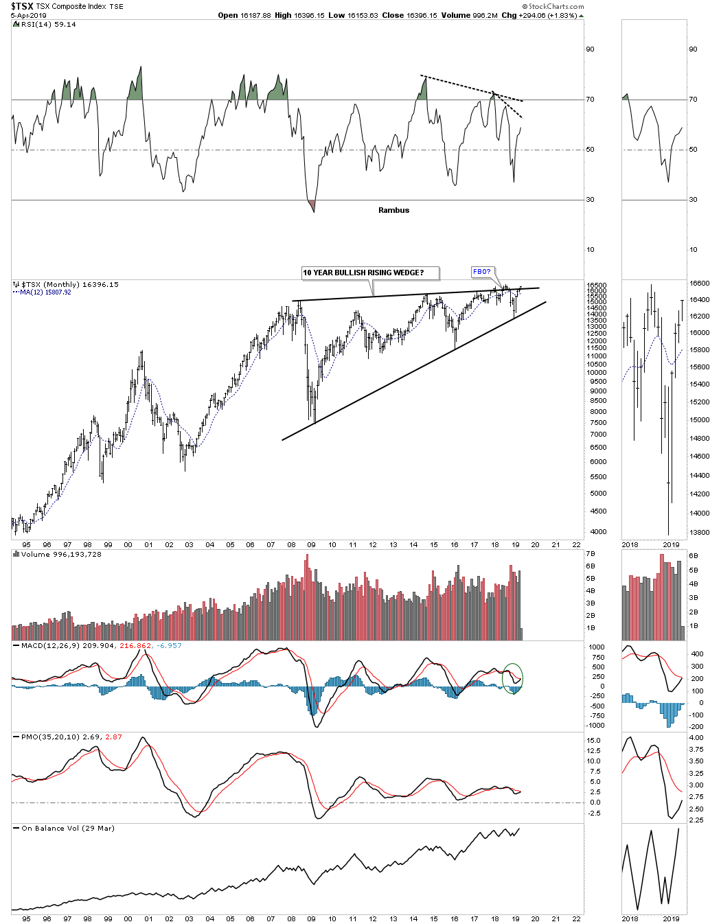
The $TSX, Toronto stock market, has been building out a ten year six point rising wedge formation. It has been attempting to breakout above the top rail for over a year which so far has failed. On the positive side the price action is trading very close to new all time highs. Since this is a commodities related stock index it should have bullish consequences for commodities in general if it can breakout strongly above the top rail.
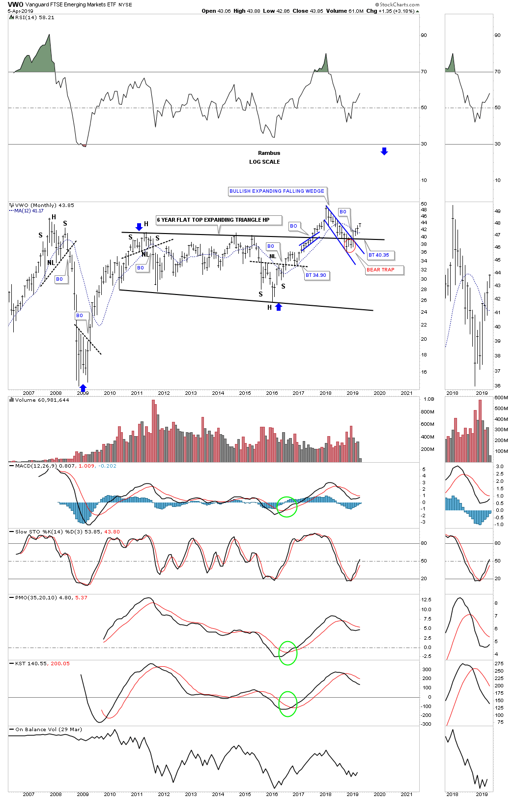
If the world is going to move forward in regards to what their stock markets are suggesting then the emerging markets should also participate. Below is a long term monthly chart for the VWO, emerging markets. After a strong rally out of its 2009 crash low the VWO has been in consolidation mode for the last six years building out the flat top expanding triangle consolidation pattern. Again, like so many other stock market indexes we’ve looked at, this emerging market etf also experienced a false breakout below the top rail of the expanding falling wedge, but reversed direction leaving behind a bear trap. I’m also viewing the six year flat top expanding triangle consolidation pattern as a halfway pattern as shown by the blue arrows.
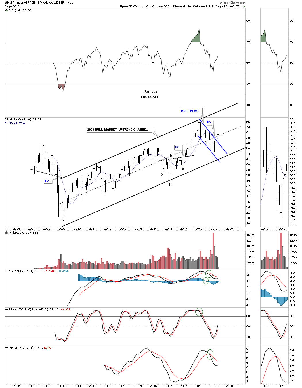
This last chart I would like to show you for this part of the Quarterly Report is the VEU, all world stock markets ex the US stock markets. The VEU has been in a nice steady bull market since its 2009 crash low. During the 2015 correction it built out a H&S consolidation pattern on the bottom rail of its 2009 major uptrend channel. Since the 2018 high when the US stock market topped out so did just about every other stock market on the planet. Since that 2018 high the VEU formed the blue flag and broke out above the top rail two full months ago.
What most of the world stock markets above are suggesting to me is that we should expect another leg higher in the secular bull market that began in 2009. Since these are long term monthly charts change comes slowly and we could see some backing and filling, but the big picture shows many of the world stock markets including our own are going to experience another leg up within their secular bull markets.
If the world stock markets are beginning to show some life then some of the underlying sectors within the stock markets should also be showing some positive chart patterns. You can’t have one without the other. As with every bull market there are leading and lagging sectors, but eventually they all generally get their shot at producing their own individual bull market.
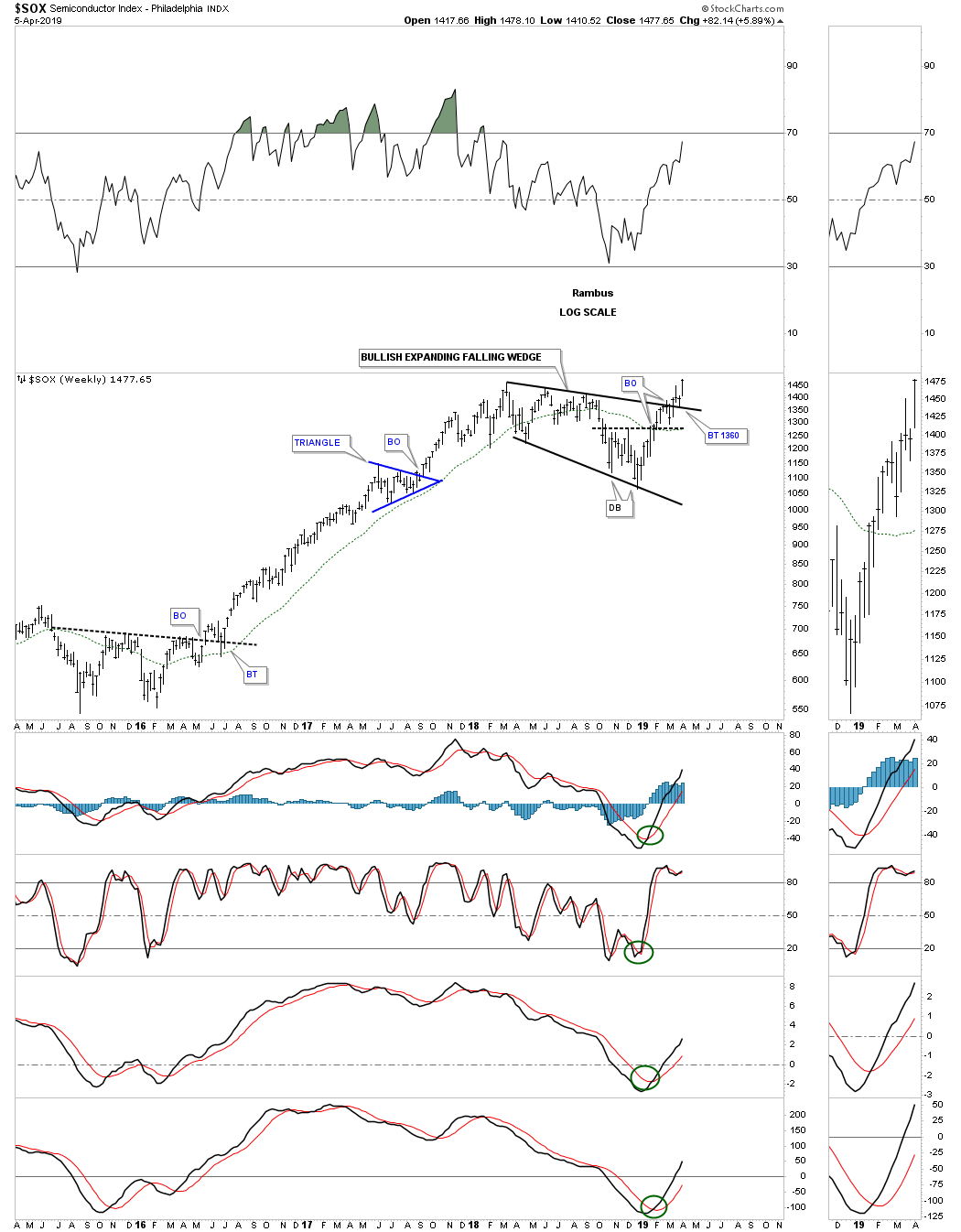
If the secular bull market is going to continue then the tech stocks will have to be one of the leading sectors. One area within the tech sector that is giving us a good clue that the markets want to go higher are the semiconductors. They are doing something they haven’t done since their 2000 bull market top.
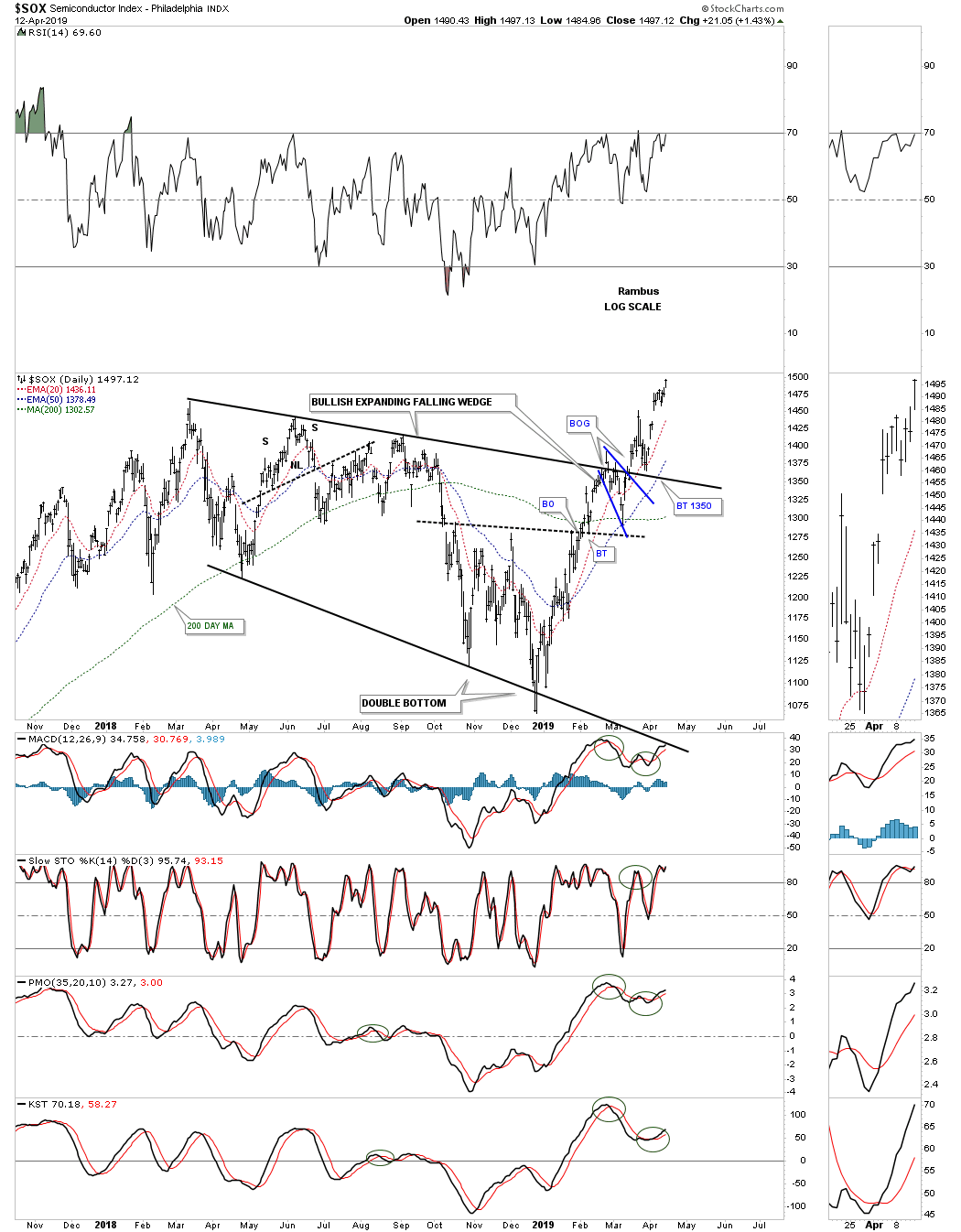
Below is a long term monthly chart for the $SOX, semiconductor index, that is now breaking out to new all time highs. The Chartology has been picture perfect. Since the 2009 bear market low notice how each impulse leg up is followed by a consolidation period which leads to another impulse leg up. This is a classic example of how a bull market is supposed to look. In the early part of January 2018 when everything was topping out so did the $SOX, but it topped out at its 2000 all time high which was a perfect place to see a consolidation pattern form. Most of the time when an important trendline or in this case the all time high is reached you will see a small consolidation pattern form just below that important area of resistance. Since the SOX has been in a bull market the odds were high that it would breakout to new all time highs which it is now doing.
The consolidation pattern that formed at the all time high was the blue expanding falling wedge which is also showing up on some of the other areas within the markets. It’s still possible we could see a backtest down to the 1350 area but the bulls have now taken back control of the semiconductor index. This area is going to be one of the leading sectors during the next phase of the bull market and is giving us an early warning that the bull market correction since the January 2018 may be coming to an end.

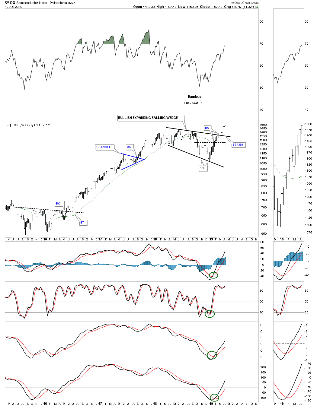
Below is the weekly chart for the SOX which shows a perfect breakout and backtest to the top rail of the January 2018 bullish expanding falling wedge.
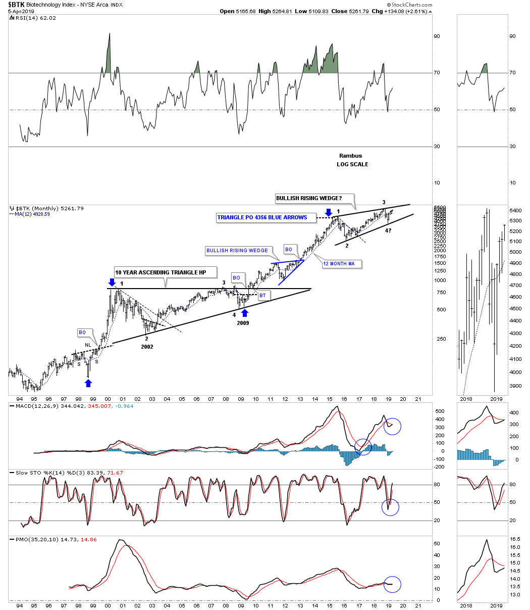
One of the strongest areas within the 2009 bull market has been the biotech stocks. The $BTK, biotechnology sector, bottomed in 2009 putting it the fourth reversal point in its ten year flat top or ascending triangle. Note how tiny the 2009 decline was compared to most of the stock markets which in many cases traded below their 2002 bear market low. This small decline was showing relative strength which showed itself in the ensuing secular bull market that is still progressing along.
The BTK has been consolidating the previous impulse leg up topping out in August of 2015 building out the nearly four year rising wedge pattern. Most will view this rising wedge as a bearish rising wedge, but since it has been forming in the secular bull market the odds favor an upside breakout. If the price action breaks out below the bottom rail then I’ll be the first one to admit I was wrong.
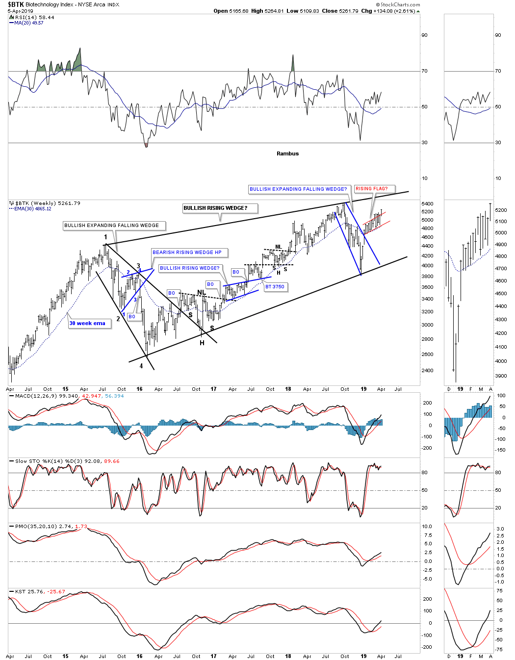
The weekly chart for the $BTK.
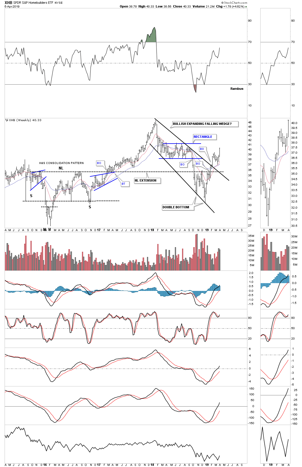
Another area we would like to see perform well is the XHB, homebuilders, which is an integral part of the economy. Here you can see another 2018 bullish expanding falling wedge breaking out and is beginning to move higher after a quick backtest to the top rail last month.
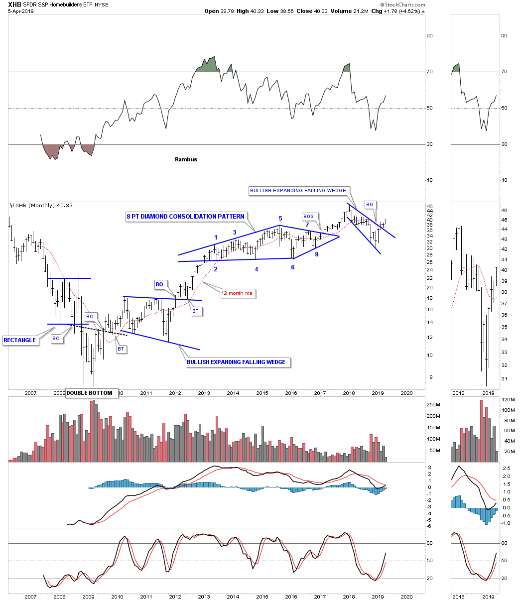
XHB weekly chart with the bullish expanding falling wedge.
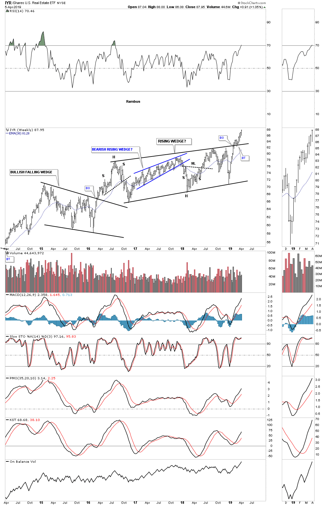
Below is the IYR, Real Estate etf, which is breaking out of from its 2016 bullish rising wedge formation in no uncertain terms. A backtest to the top rail is always possible but not necessary.
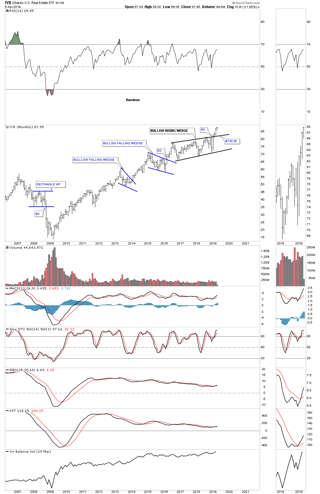
The weekly chart for the IYR.
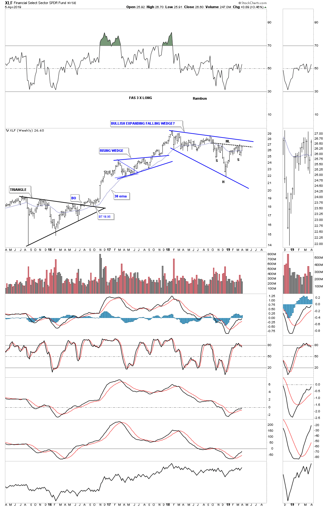
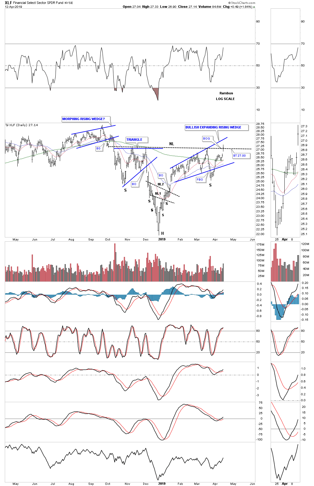
Another very important area that needs to be strong during a bull market run is the XLF, financial sector, which is building out its own expanding falling wedge formation within its 2009 bull market uptrend channel.
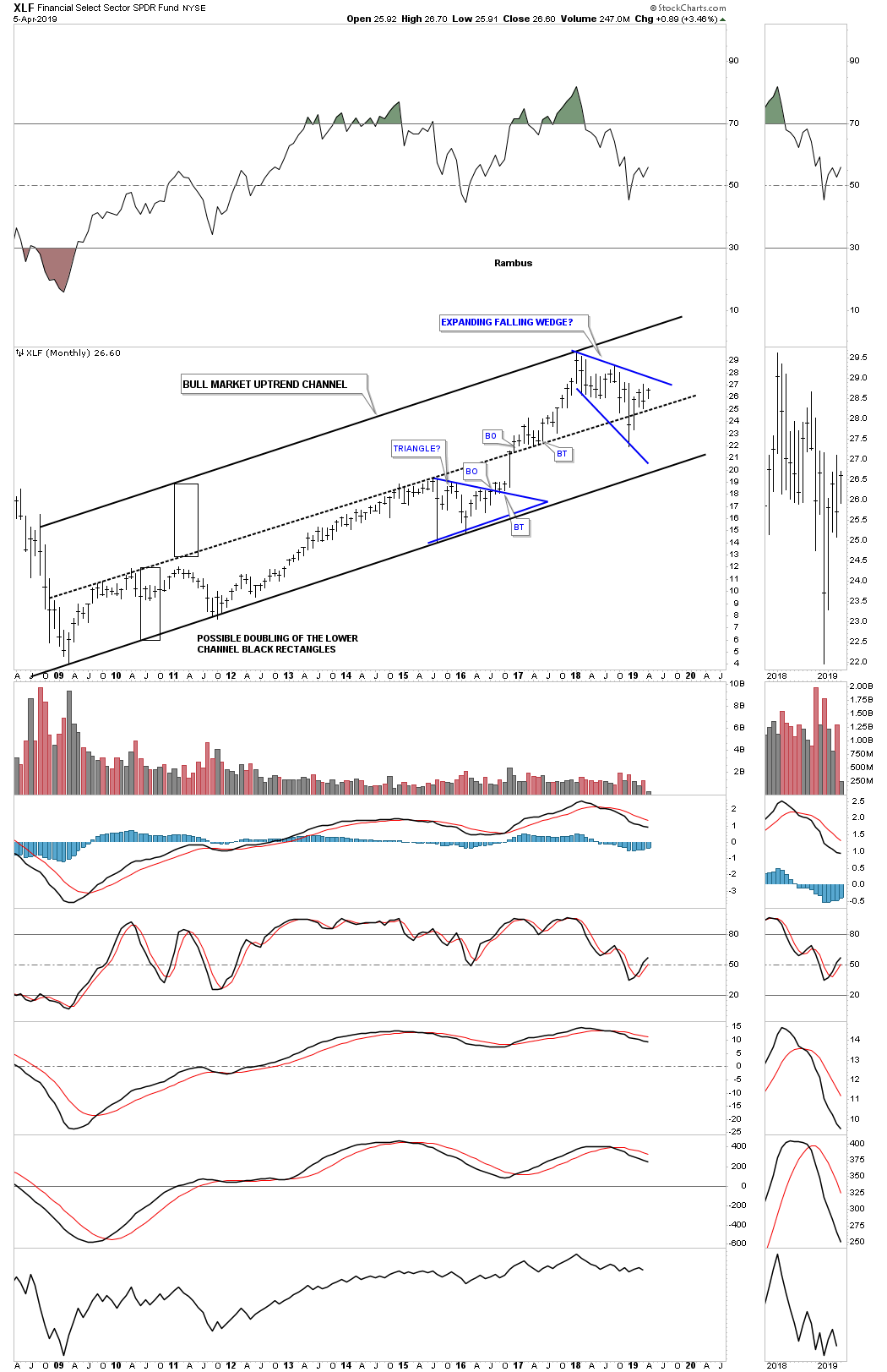
This weekly chart for the XLF shows a potential very bullish setup with a H&S bottom forming at the last reversal point in the blue expanding falling wedge. I suspect we will most likely see a ping pong move between the neckline and the top rail of the bullish expanding falling wedge before the actual breakout takes hold.
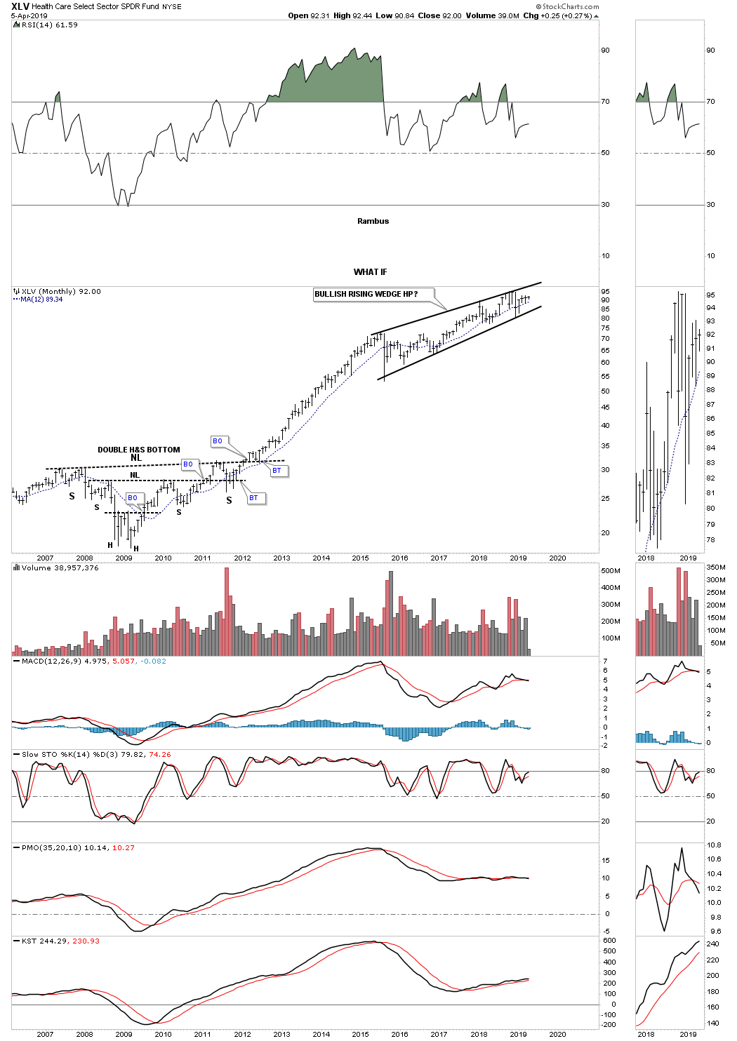
Another area that has done exceedingly well since the 2009 crash low has been the XLV, Health Care sector, which had a four year uninterrupted impulse move into the first reversal point in a growing four plus year rising wedge formation. Again, most will view the 2015 rising wedge formation as a bearish rising wedge, but, “WHAT IF” the rising wedge is a bullish rising wedge? Note the massive 2009 H&S bottom which led to the uninterrupted move into the rising wedge. Big patterns lead to big moves and the XLV has built out a big pattern.
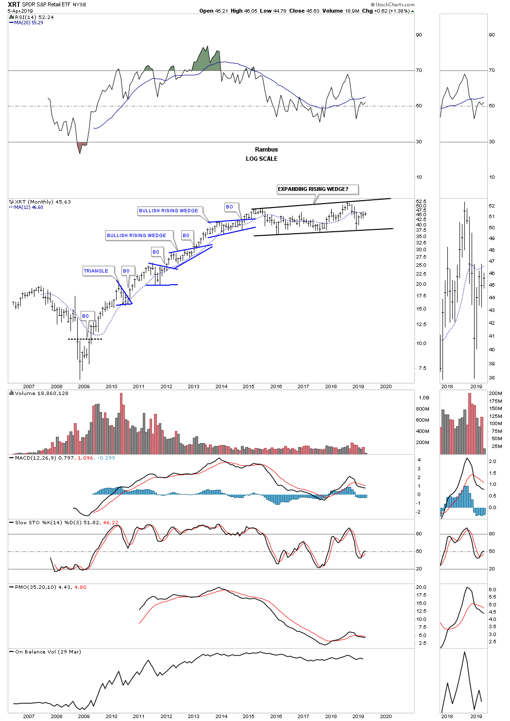
Another area that had a good bull market run out of its 2009 crash low was the XRT, Retail etf. It has been consolidating that first six year bull run forming a large expanding rising wedge formation which could very well be a halfway pattern to the upside.
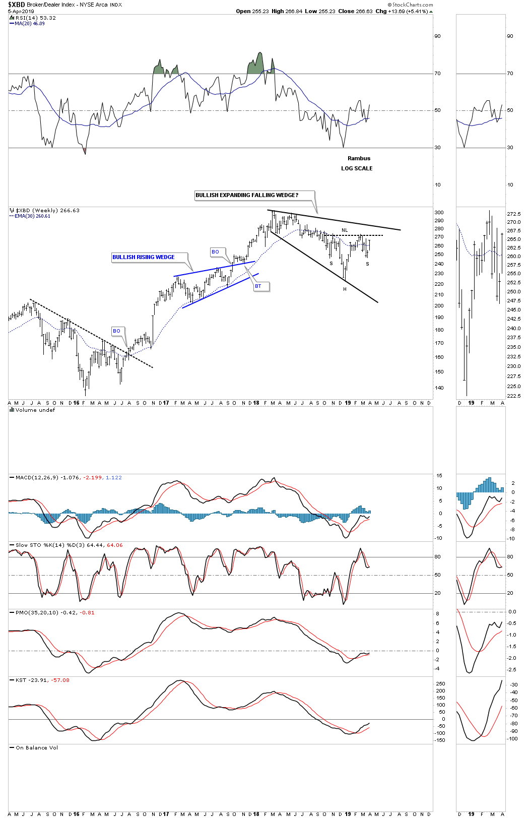
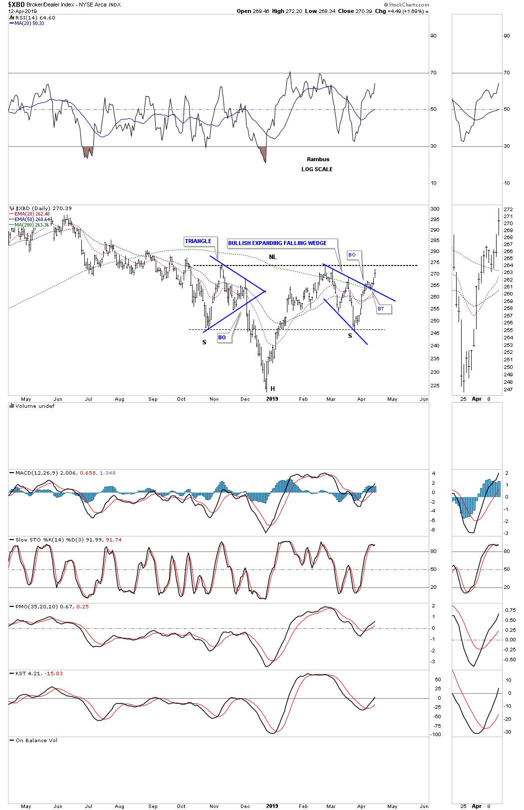
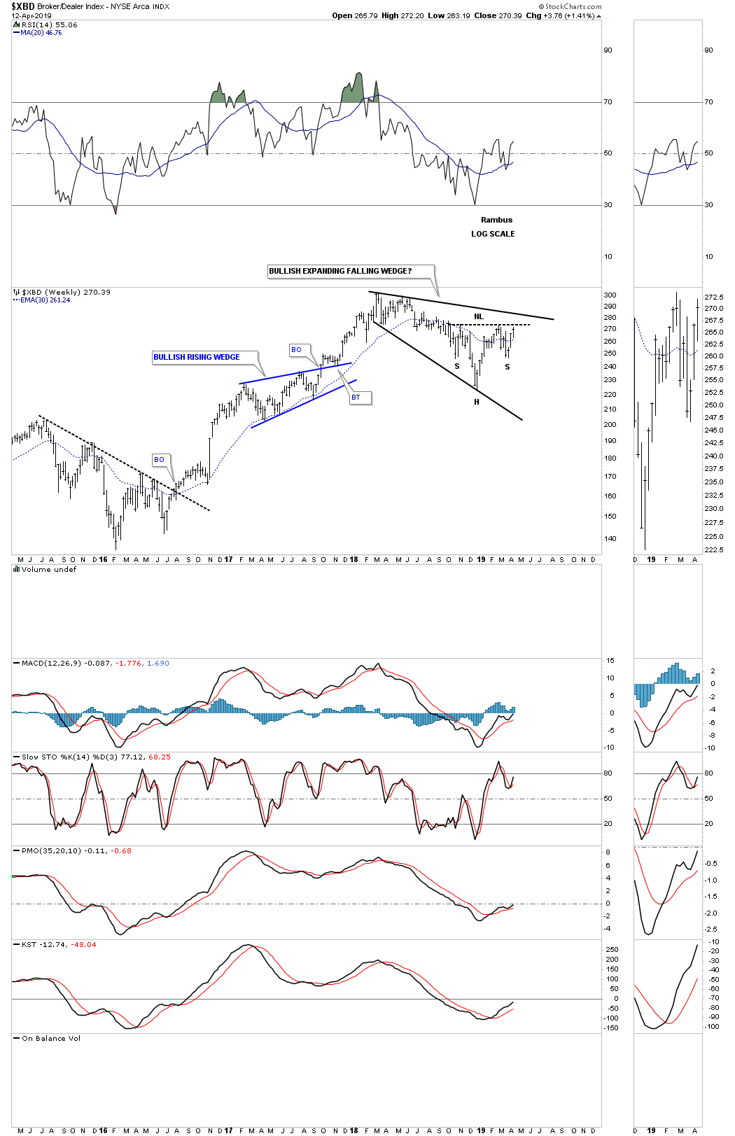
This last chart I would like to show you tonight is the $XBD, Broker/Dealer index, which is forming its own 2018 expanding falling wedge with the H&S bottom forming at the fourth reversal point which is a very bullish setup.
This completes part two of the Quarterly Report with currencies and commodities to follow. I realize how ridiculous these long term charts are to someone that has been a perma bear for the entire secular bull market that started at the 2009 crash low. How can the markets just keep going up? It makes no sense. That’s why the markets keep going up because they make no rational sense from the bearish perspective.
This greatest bull market of all time is going to come to and end one day and when it does there will be a multi year correction that could last 10 to 15 years or even longer as we saw in gold after its 1980 bull market high. Secular bull markets are rare but I’ve been lucky enough to have lived and traded during the 1980 to the 2000 secular bull market that changed my life forever and now I’m lucky enough to be part of our current secular bull market that began in 2009.
Experiencing one of these secular bull markets in ones lifetime is great but for most investors they will never see it until the end when everyone piles in with reckless abandon. We still haven’t gotten to the IPO stage where stocks that are virtually worthless will be bid up to astronomical prices. The mania phase will come but it’s not here yet that’s what these big chart patterns are suggesting. Maybe after this next big impulse leg up we’ll see the mainia phase and with a little luck we’ll get out in time to enjoy our profits. All the best..Rambus
Quarterly Report Part 3… Stock Market Illusion
Houdini was a master magician who created illusions that kept his audience sitting on the edge of their seat wondering in amazement, how in the world did he do what he just did. Some even believed his magic was real because they couldn’t understand the principals behind what their eyes were actually seeing. Their brains were being deceived by what their eyes had just seen which made no sense whatsoever so his magic must be real, but as we know it was just an illusion.
Illusion. NOUN: A thing that is or is likely to be wrongly perceived or interpreted by the senses.
The stock markets and Houdini have a lot in common which is to create an illusion that we interpret by our brains as one thing but is totally different in reality. This illusion is something we all fight psychologically everyday that we are in the markets. Our brains tell us one thing the market should be doing but in reality the markets are doing something totally different that we don’t understand.
For instance the US stock markets have been in one of the most explosive moves off the Christmas Eve low in history. Our brains are telling us this rally isn’t real because of all the fundamental reasons we’re looking for that tell us the stock markets shouldn’t be rallying like this. What are brains are perceiving and what is reality are not in sync. This is the only way the stock markets can work. In order to have a bull market most participants have to be in denial as the markets keep going up, and the higher they go up their denial becomes even more extreme.
Finally at their breaking point of being in denial for so long they throw up their hands and jump in with both feet feeling confident now that the bull market is for real and it’s finally safe to put their hard earned capital to work. For awhile they enjoy the benefits of the bull market they had distrusted for so long and feel good about finally getting on board and making a few bucks. Once the bull market has the last of the doubters on board, the illusion that the bull market will keep go up forever because it has entered a new paradigm, will catch most of the late comers off guard as the markets begin topping out.
Up to this point each consolidation period has always led to a new impulse move higher which now becomes the norm. As the late comers are finally happy and congratulating themselves for being brave enough to finally get on board the bull market, their new found exuberance will be tested as what looks like the next consolidation phase actually turns out to be a reversal pattern which is not what they were expecting. Since they don’t know what a reversal pattern looks like they assume that after the trading range completes they will be richly rewarded with another strong impulse move up which will never come, but instead they’re subjected to the first impulse leg down in a new bear market that is usually pretty extreme initally which traps the late comers and everyone else that doesn’t recognize what is taking place.
Lets look at some charts to see if we can decipher if our current bull market is an illusion or realty. Currently there are a couple of bigger chart pattens we’ve been following very closely which is the the January 2018 expanding triangle and the blue bullish expanding falling wedge. We know that there has to be an even number of reversal points to buildout a consolidation pattern and an odd number of reversal points for a reversal pattern. As you can see the SPX is working on its fourth reversal point which won’t be complete until the top rail of the expanding triangle is reached which is getting close. That will technically complete the expanding triangle as a consolidation pattern to the upside. If the expanding triangle is going to be a reversal pattern then the top rail will have to hold resistance until the price action declines all the way backdown to the bottom rail to complete the fifth reversal point.
How the price action interacts with the top rail of the expanding triangle will be very interesting. Normally we should see an initial hit with a small decline followed by a breakout above the top rail and then a possible backtest to confirm the expanding triangle as the next consolidation pattern in the secular bull market that began in 2009. You can look at the two lower consolidation patterns to see what their breaking out and backtesting process looked like before they began their impulse move higher.
Not all, but many investors believe the stock markets can’t keep going up at the rate they have because it just doesn’t make sense to them. The January 2018 high was supposed to be the beginning of the next bear market and then the higher high made in September of last year was definitely the end of the bull market that began in 2009. That rally high at reversal point #3, on the weekly chart above, was then followed by the biggest decline for the January 2018 trading range which put the fear of God into investor’s souls who now could proclaim they were right. There is no doubt that was damaging psychologically for everyone including myself.
Whenever a trading range makes a lower low that is usually a very important clue to be on the lookout for a trend change. On the other hand these types of moves can lead to a bear trap, to shakeout the weak investors if we see some type of reversal pattern that starts building out at the new lower low. These types of patterns that make a lower low are the most difficult patterns to spot in real time because it feels like the end of the world when the last reversal point is made. You can see the example of the bullish expanding falling wedge which formed during the 2015 correction, on the weekly chart above, as it made a lower low to complete the fourth reversal point. Note the small double bottom at the last reversal point that was needed to complete the fourth reversal point which also was the very beginning of the two year impulse move up into the January 2018 high.
Keeping the 2015 bullish expanding falling wedge in mind with the small double bottom at the last reversal point, lets look at our 2018 expanding triangle in the same light keeping in mind we need to see some type of reversal pattern form at the fourth reversal point to keep the expanding triangle in the consolidation camp and not a reversal pattern.
While investors pontificate on where the markets are headed, using the SPX as an example, the price action has been quietly building out a multi neckline H&S bottom. This is an illusion that most investors are not even aware of. Most investors are still psychologically scared from the hard decline from the third reversal point to the fourth reversal point in the 2018 expanding triangle and they have every right to be but being psychologically scared doesn’t make you any money and keeps you on the sidelines while your wounds are healing.
Now I would like to show you the illusion the SPX and many other areas in the markets have secretly been forming since October of last year. These H&S bottoms have been under construction since October of last year which has been almost six months ago and no ones seems to have noticed. These multi neckline H&S bottoms are forming in reverse symmetry to the tops made on the way down and the tops being made on the way up since the December 24th low. Each high on the left side of the head corresponds to the highs made on the right side of the head which creates the necklines.
You may recall back in February we took nine different positions when the price action broke out from neckline #1 competing the first H&S bottom. I got shaken out of that initial trade about a month later in early March when the SPX started to decline and I didn’t want to give back our profits on the nine trades that were all positive. In hindsight you can see that was a mistake which I wrote about in a later post stating, “you never go broke taking a profit,” which I said was BS. What generally happens when you get out too early is that you almost always have to pay up to get back in and that is exactly what happened. I began accumulate our new positions starting on March 19th when I bought the SOXL, 3 X long the semiconductor eft.
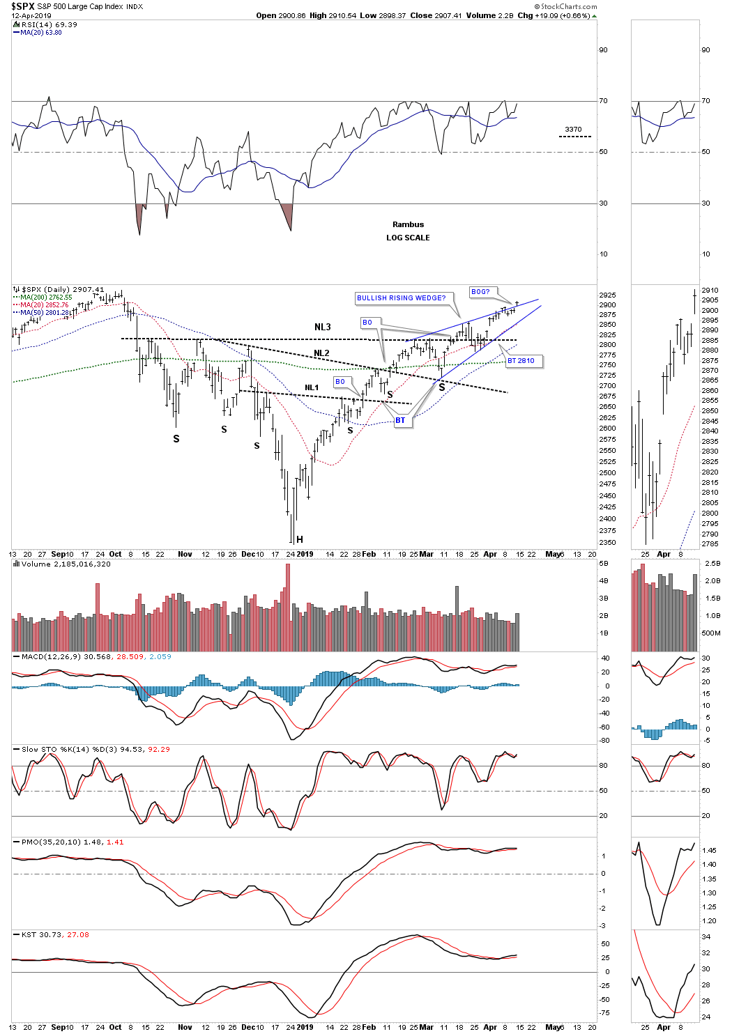
It’s easy to see in hindsight what’s the best course of action but in real time it’s a different story. Note the breakout above neckline #2 on the daily chart for the SPX below, and the clean backtest to the neckline which produced the right shoulder for neckline #3. I’ve been showing you the potential bullish rising wedge which has been forming since February 25th on the daily combo charts. The price action has been attempting to breakout above the top rail of the rising wedge for about a week now. If the breakout takes hold we know from past experience that these types of patterns, that slope up in the same direction of the main trend, can signal that a very powerful move is about to take place. We are there. Now we just need to see some follow through to the upside to confirm the bullish rising wedge. The other thing about a bullish rising wedge is that it’s sometimes called a running correction which gives the indicators a chance to correct while the price action is still moving higher.
The last point I would like to make on this daily chart for the SPX before we move on is the price objective for the H&S bottom that is much higher than the top rail of the January 2018 expanding triangle which is strongly suggesting a breakout is going to occur to complete the expanding triangle as another halfway pattern in the 2009 secular bull market.
Now that you are aware of the bear market illusion that many investors believe is true lets look at reality from a Chartology perspective which takes out all the fundamental noise and bearish bias that many investors believe is their reality. I won’t spend a lot of time describing these next charts to follow as you have a blueprint on the daily SPX chart above.
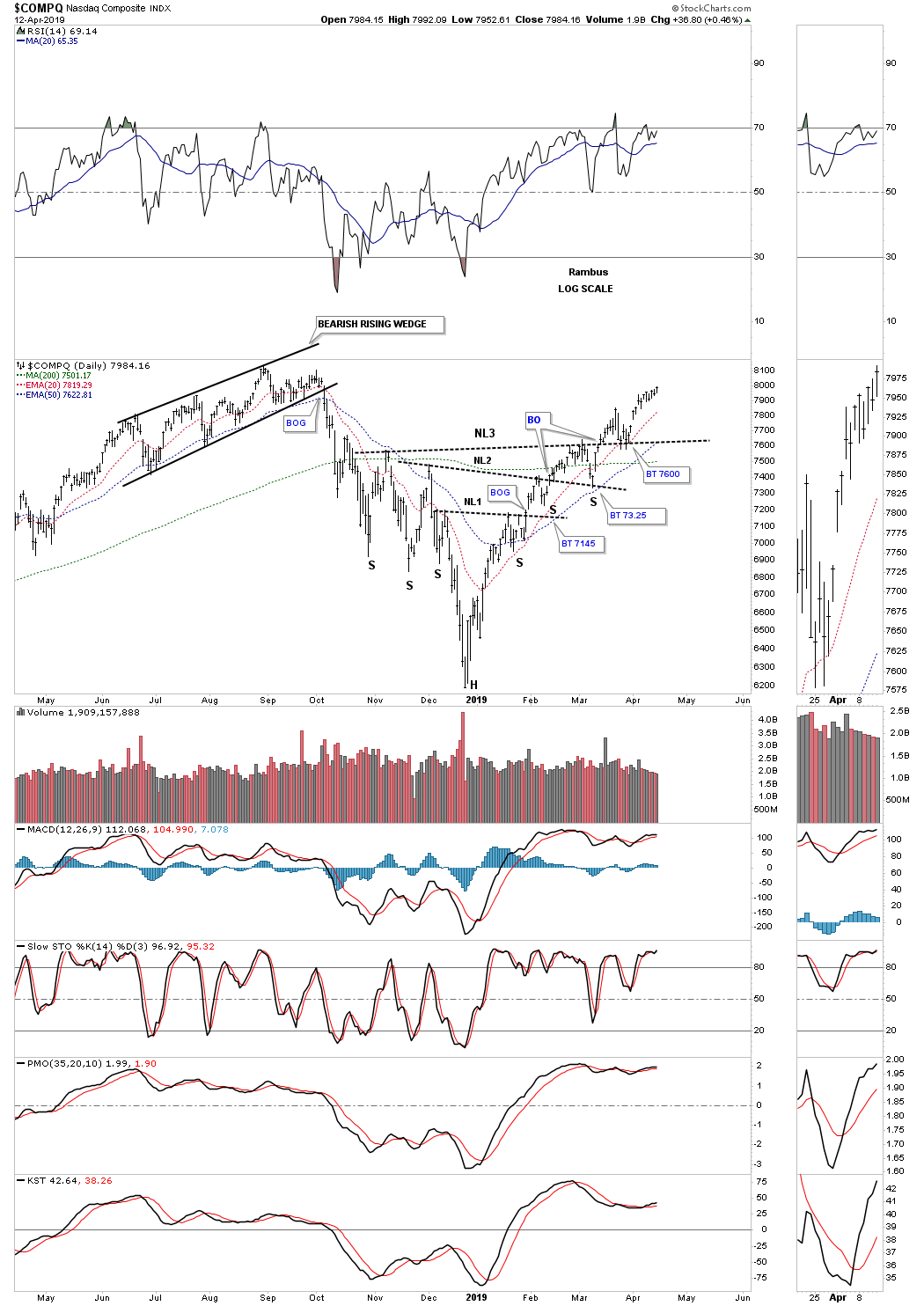
The tech stocks have been one of the leading sectors since the December 24th low. One point I need to make right here when you look at this daily chart for the $COMPQ is that you may note the right shoulders are smaller than the left shoulders, You tend to see this take place when a stock is in a hurry to move higher. It still builds out the right shoulder but from a time perspective it can be much shorter, again signaling the stock wants to move higher in no uncertain terms.
Next is the $INDU, which has been showing some nice reverse symmetry during the formation of its multiple H&S bottom. Even with all the negative news about Boeing, neckline #4 has so far held support on its backtest.
Next is the $NYA which is a broad measure of stocks, that broke out above neckline #3 about two weeks ago with this past Friday’s price action making a new high since the December 24th low.
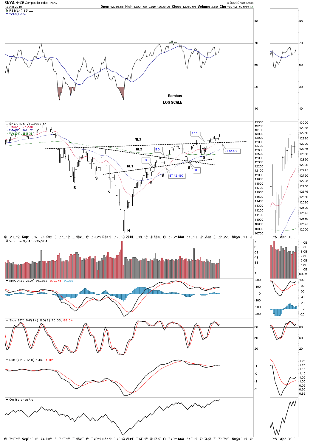
While we are on the NYA lets look at the weekly chart as it shows another dominate chart pattern that is showing up all over the place in many different areas within the markets. While most of the US stock markets are showing an expanding triangle as their 2018 trading range, the $NYA is showing a bullish expanding falling wedge. The price action is currently testing the top rail as shown by the red circle. I’m showing the more conservative breakout which closed just above the top rail last Friday, black trendline. From strictly a Chartology perspective I drew in a red trendline which I think is where the actual breakout took place. I know it doesn’t look like a big deal and in reality it’s not. How the price action interacts with an important trendline is a big deal for future reference. Note how the NYA spiked up to the red trendline and then backed off suggesting the red trendline was hot. Two weeks later you can see a breakout gap above the red trednline strongly suggesting the red trendline is properly placed. This is an important part of Chartology that can give you a big clue on where to actually draw in a trendline and where to look for a backtest.
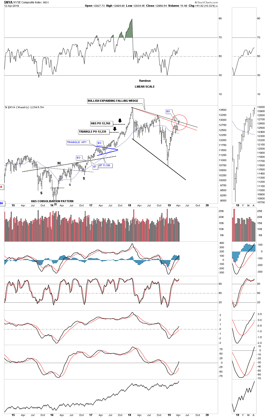
Below is another weekly chart which shows how the October H&S bottom, on the daily chart above, fits into the bigger picture forming at the fourth reversal point in the January 2018 bullish expanding falling wedge. It’s barely visible on this weekly chart but you can see a very small ping pong move between the top rail of the falling wedge and the neckline which again is not a big deal on this chart but it’s something to look for when a similar situation comes into play down the road. It lets you know both trendlines are hot and gives you a point of reference which so many investors have no idea how the current price action fits into the big picture.
I know I’m probably beating a dead horse on the NYA but there is one more chart pattern we’ve been following very closely for the last couple of years which shows how the January 2018 expanding falling wedge fits into the very large picture. During the December 2018 low I was watching this chart very closely as I was hoping that the neckline would hold support on the backtest. As you can see the backtest was a little strong but the neckline held support. That massive H&S bottom will become more visible to most investors when the next impulse move higher begins to take hold, This will isolate the ten year H&S bottom leaving it standing out like a sore thumb with an impulse move leading into it and one leaving out of it.

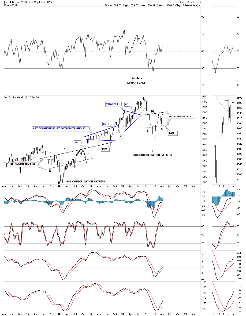
The $RUT, Russel 2000, has been a little weak compared to some of the other US stock markets we’ve looked at but it still has all the same characteristics as the daily H&S bottoms above. This is a good chart fo follow if you want to see how the price action interacts with neckline #3 in real time.

I would like to show you the weekly chart for the $RUT because it has some Chartology that some of the other US stock markets are showing. The first thing you may have noticed is the H&S bottom that formed at the last important low which led to the rally into the January 2018 high. Shortly after the breakout above the neckline the RUT proceeded to chop sideways forming an eight point expanding triangle consolidation pattern, look familiar? Most chartists view an expanding or broadening triangle as a bearish pattern but like so many other patterns, it’s the direction of the breakout that is most important.
The relative weakness we are currently seeing in the RUT vs the other US stock markets is the fact that it was the strongest area during the 2016 – 2018 rally phase as it didn’t top out until August of 2018, a full seven months later. Note how the current H&S consolidation pattern is beginning to look like a H&S bottom vs just three weeks ago when there wasn’t a right shoulder.
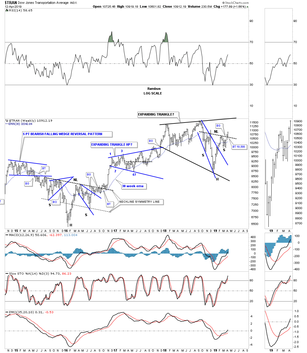
I’m going to use the daily Transportation Average to show you all the patterns that make up the H&S bottom. When you first look at this daily chart it might look pretty busy to you but we’ll break it down into its component parts that will make it simple to understand. The first pattern we’ll look at is the black bullish expanding falling wedge which was the second pattern that strongly suggested an important reversal point may be at hand when the top rail was broken to the upside with a small breakout gap. After about eight days of ralling the price action reversed direction and began to decline. Armed with our Chartology the first place we needed to look for initial support was a backtest to neckline #1 which is the same neckline we see on the daily charts above. That backtest to neckline #2 also gave us a classic example of how a H&S bottom can form when the left shoulder and head form inside a falling wedge or flag, in this case the backtest to the top rail of the expanding falling wedge, forming the low for the right shoulder. Note how neckline #1 held support on three separate occasions at 10,000 before the Transportation Average finally completed all the work forming the H&S reversal pattern. Symmetry is sometimes in the eye of the beholder but in this case you can see the left shoulder formed the blue bearish rising wedge while the right shoulder formed the blue triangle at roughly the same area on both sides of the head.
![]()
This weekly chart for the Transportation Average puts the latest H&S bottom in perspective within the bigger black expanding triangle. Note the beautiful symmetry of the 2016 H&S bottom which led to a two year rally and the blue expanding triangle that formed at the halfway mark of the 2016 – 2018 rally.
Lets now look at some other areas of the markets that are exhibiting some of the same characteristics as the stock markets October H&S bottom. The XLF, financial sector, just broke out above its neckline with a breakout gap last Friday. This is another stock where we could see a ping pong move between the top rail of the blue expanding rising wedge and the neckline at the 27.00 area. This is one area that needs to perform well during the next major impulse move higher.
Another area related to the financials is the $XBD, brokers and dealer index, which is forming a very symmetrical October H&S bottom. This is another stock you can watch in real time as it’s approaching its neckline to observe the breaking out and backtesting process.
I mentioned earlier that the 2018 bullish expanding falling wedge was one of the dominate chart patterns showing up on a lot of different areas of the markets. Here is another good example with the H&S bottom forming at the fourth reversal point low.
This next H&S bottom that we’ll look at is setup just a bit differently than the ones we looked at above. This H&S bottom on the EEM, emerging markets etf, is in the process of getting all the work done before it can begin to move higher.

One of the hottest areas in the markets right now is the $SOX, semiconductor index, which broke out from its 2018 black bullish expanding falling wedge with a second breakout of the smaller blue expanding falling wedge which has led to new all time highs. This breakout to new all time highs in this sector bodes well for the stock markets in general.
The weekly chart.
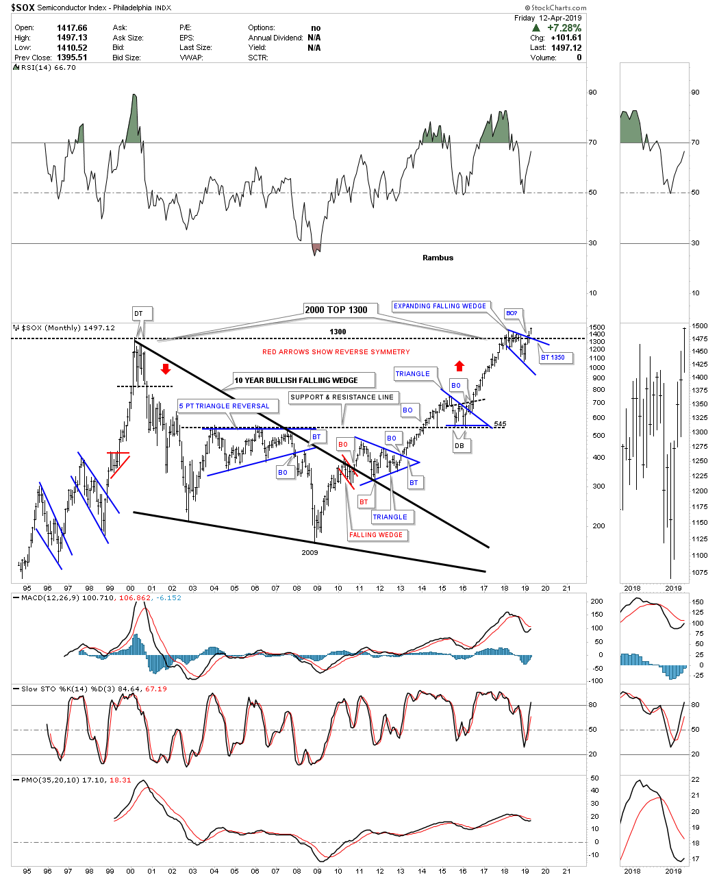
I’ve shown you this long term monthly chart for the $SOX recently but the three impulse moves out of the 2009 crash low shows us what we should expect for our current impulse leg which is just getting underway.
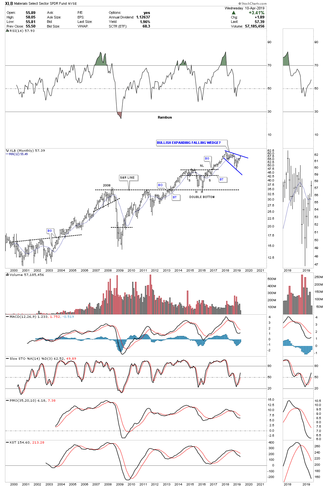
This last chart we’ll look at is the XLB, basic materials sector, which shows its October 2018 H&S bottom with a breakout gap above the neckline and no backtest at least up to this point. If we do get a backtest to the neckline it would come in around the 56.00 area.
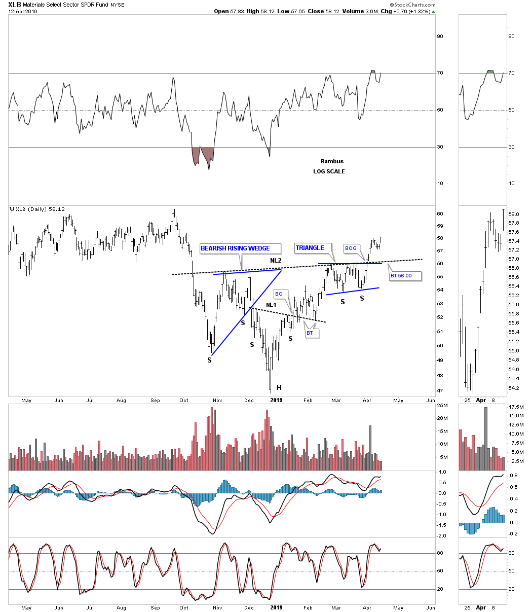
The XLB is another area that is showing the 2018 trading range as a bullish expanding falling wedge. Since a lot of the stocks that make up the XLB are in the $INDU these two tend to move together, not point for point but on a relative basis. If we see the bullish expanding falling wedge being broken to the upside that should be a bullish for the INDU and the stock markets in general.
In order to keep these October 2018 H&S bottoms alive we need to see their necklines hold support. If they start failing then the illusion of a bull market will be on me but until then I have to go with what the charts are strongly suggesting which is they’ve been forming a reversal pattern since October of 2018 which should lead to new all time highs. All the best…Rambus
Quarterly Report Part 4… Commodities
Before we look at some charts tonight I need to apologize for this Wednesday Report being limited. A crew checking telephone poles accidentally cut our wi fi connection so I’m working on back up plan #3. Hopefully they will get the problem fixed tomorrow. There is so much to show you but I’v gone back to the stone age tonight.
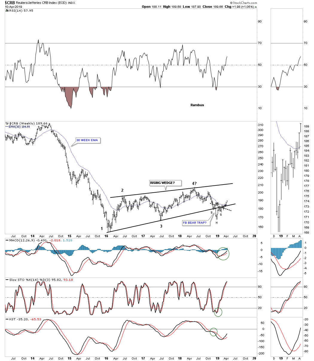
The charts are pretty self explanatory and should be easy to understand. With that said I would like to show you some commodities related charts which will give you a feel for what is taking place in this area of the markets. This weekly chart for the CRB index shows a four point rising wedge that completed four reversal points and broke out below the bottom rail. After a two week decline it was time for the backtest which occurred but a funny thing happened when it was time to decline again. Instead of declining in an impulse move the backtest area built out a right shoulder of an inverse H&S bottom. So now the price action below the bottom rail of the rising wedge is a bear trap.
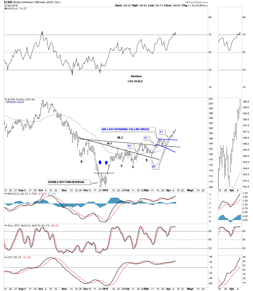
This daily chart shows the double H&S bottom with a new impulse leg up.
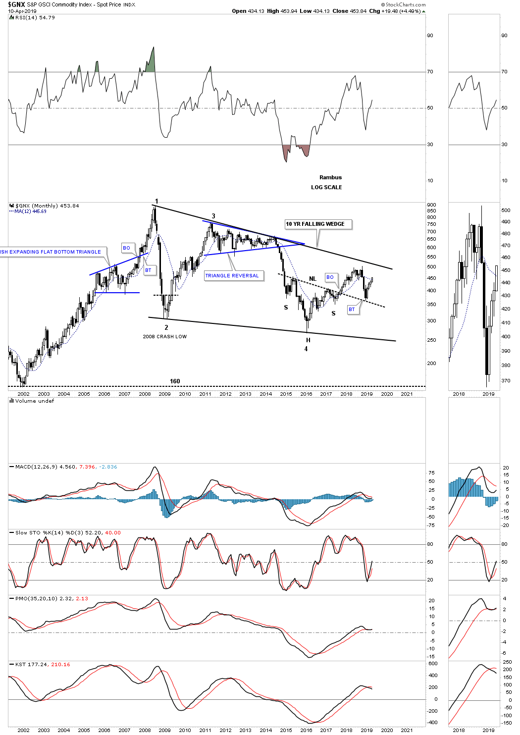
This next commodity index is a long term monthly chart for the $GNX, S&P GSCI commodities index, which is still trading inside of its ten year falling wedge. After putting in a H&S bottom at the fourth reversal point the GNX enjoyed a decent rally out of its 20`6 low like so many other areas of the markets. Five months ago it found support on a backtest to the neckline extension line and is now moving higher.
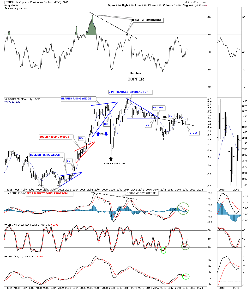
This monthly chart for Copper shows a similar setup we’ve been seeing with 2016 H&S bottoms followed by a strong move higher and then a late backtest to the neckline with a new impulse leg beginning. Note the three rising wedges on the left side of the chart. The bottom two were bullish rising wedges and the top rising wedge a reversal.
I’ve been showing you one of the stronger areas within the commodities complex which is oil. What makes oil so strong right now is that it has just broken out from a bullish rising wedge which shows up in strong stocks. It’s a classic with two small blue consolidation patterns that make up the bulk of the bullish rising wedge. There was a nice clean breakout above the top rail with a backtest two days later. The blue arrows show how it could reverse symmetry up over the same area on the way down.
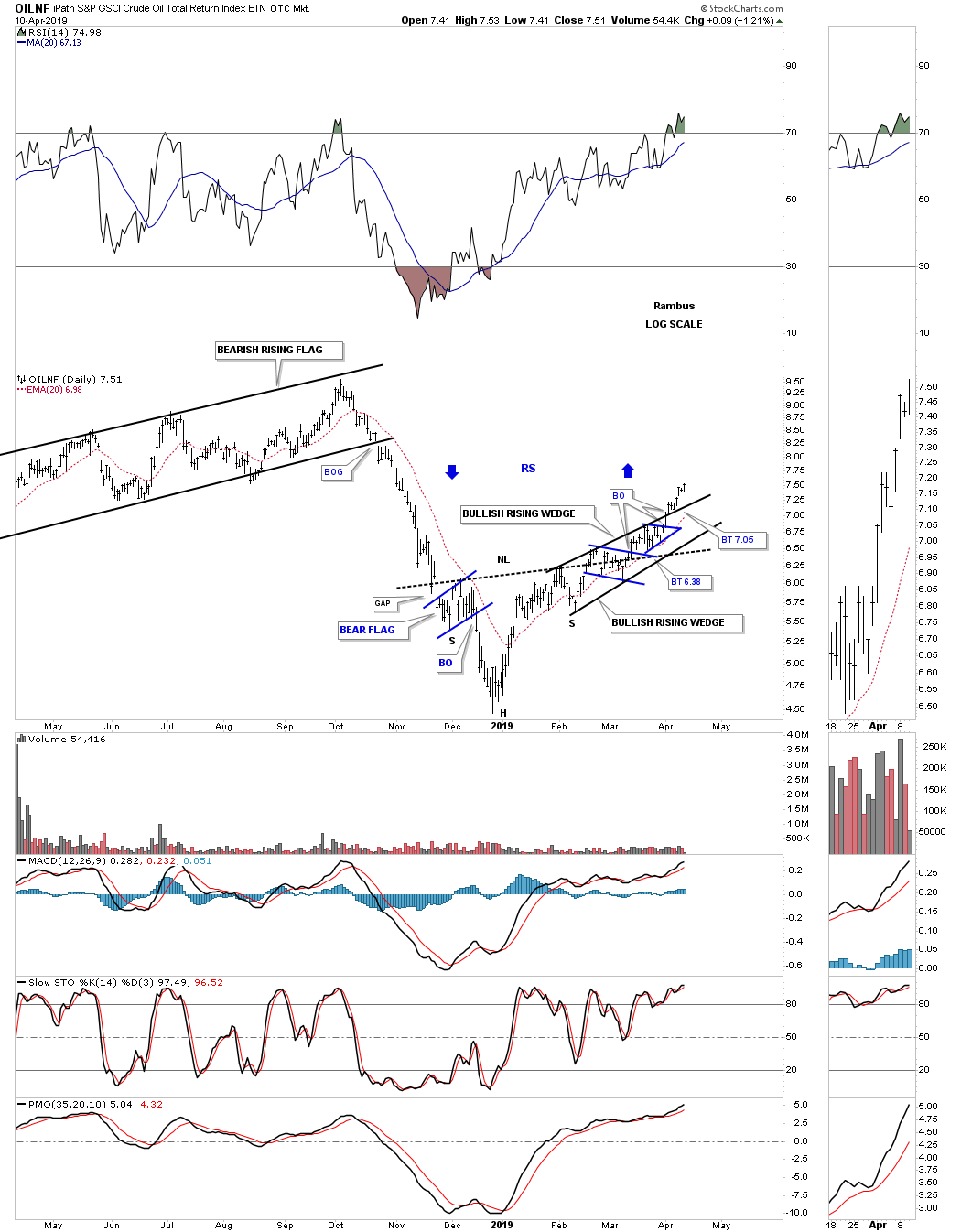
This next chart shows how the bullish rising wedge fits into the big picture. Also of interest is the 2016 low that just about every market experienced from the PM complex and the stock markets which went on a two year rally. You can also see how oil bottomed with the stock markets on December 24th of last year. As long as oil doesn’t get too hot it will be a good sign for the stock markets.
Next is a daily chart for the $WTIC, crude oil EOD chart, which shows its bullish rising wedge.
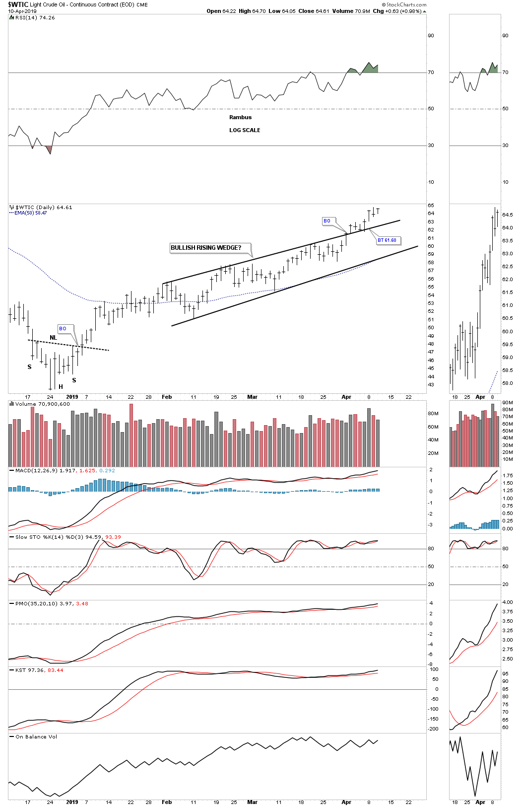
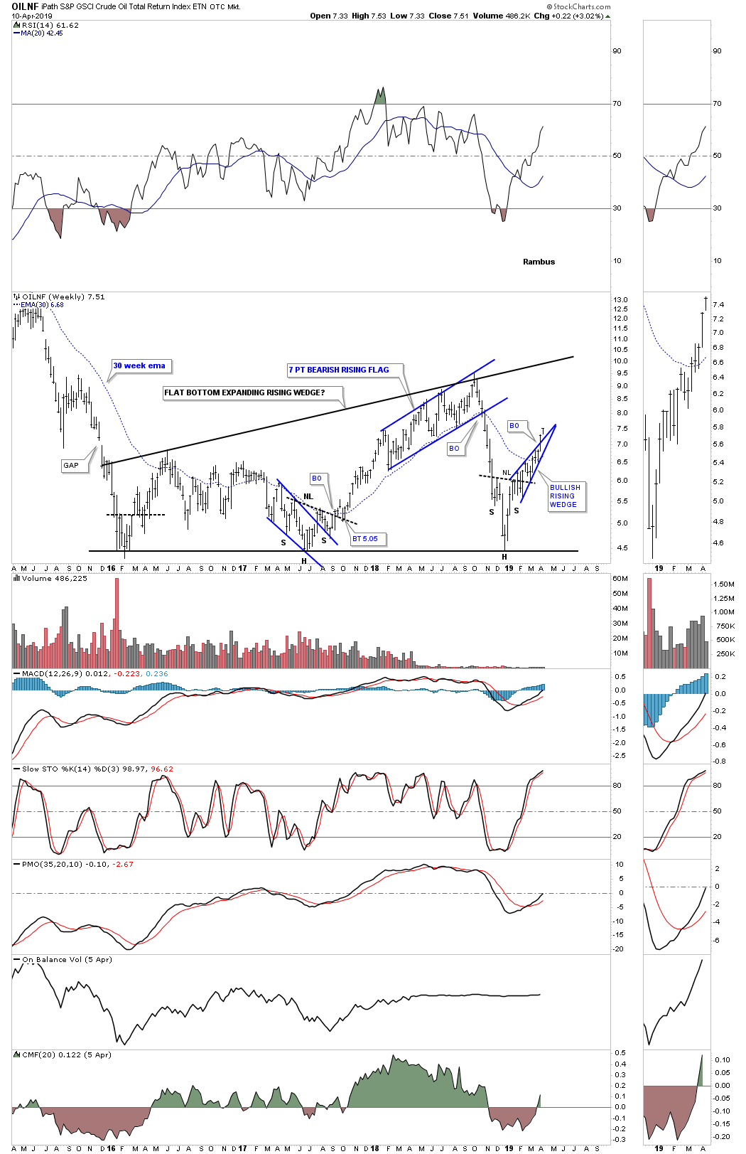
This next chart is a long term daily look at $WTIC which shows its parabolic run to 147 which started from a small H&S bottom. On the way to 147 WTIC formed a small red bullish rising flag halfway pattern. Since it sloped up in the direction of the impulse leg it told us WTIC was very strong. This chart also shows you what happens after a parabolic blowoff. Then there is that massive unbalanced H&S top which seemed like it would never complete. Every time the price action would come down and touched the neckline I just knew it was going to finally give way, but that wasn’t the case. That is one of the problems when you recognize a big pattern early on. They can wear you out sometimes before they finally show their hand. Once all the energy was released to the downside WTIC began the bottoming process with the head of the H&S bottom forming in early 2016 which led to a decent move to the upside. The neckline extension line came into play holding support on recent the backtest.

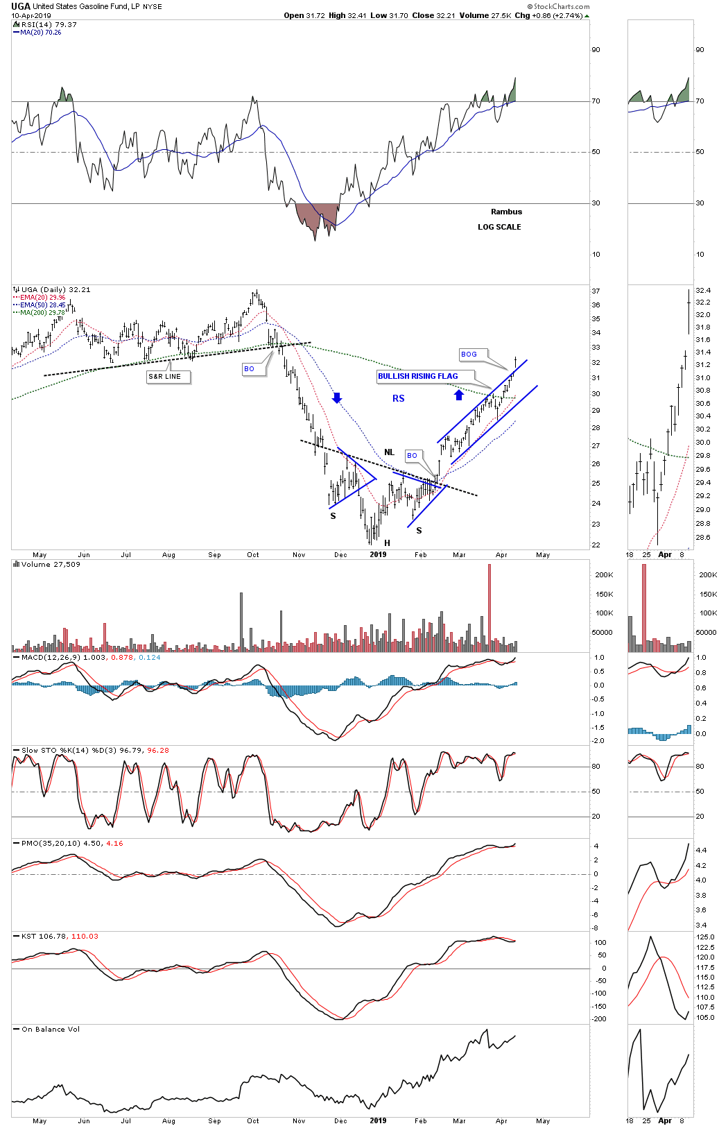
Another area that has been on fire in the energy sector is the UGA, gasoline, which broke out from a bullish rising flag today with a breakout gap.
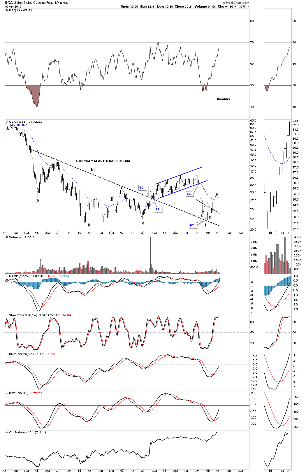
UGA weekly strongly slanted H&S bottom.
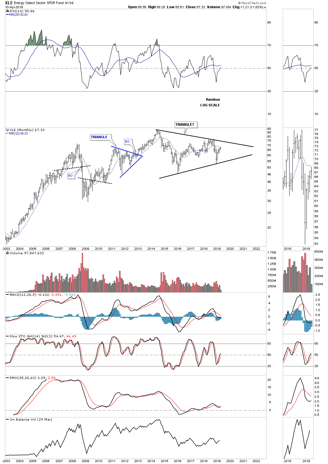
The XLE is an energy stock fund which is attempting to put in a H&S bottom at the fourth reversal point in its triangle consolidation pattern.
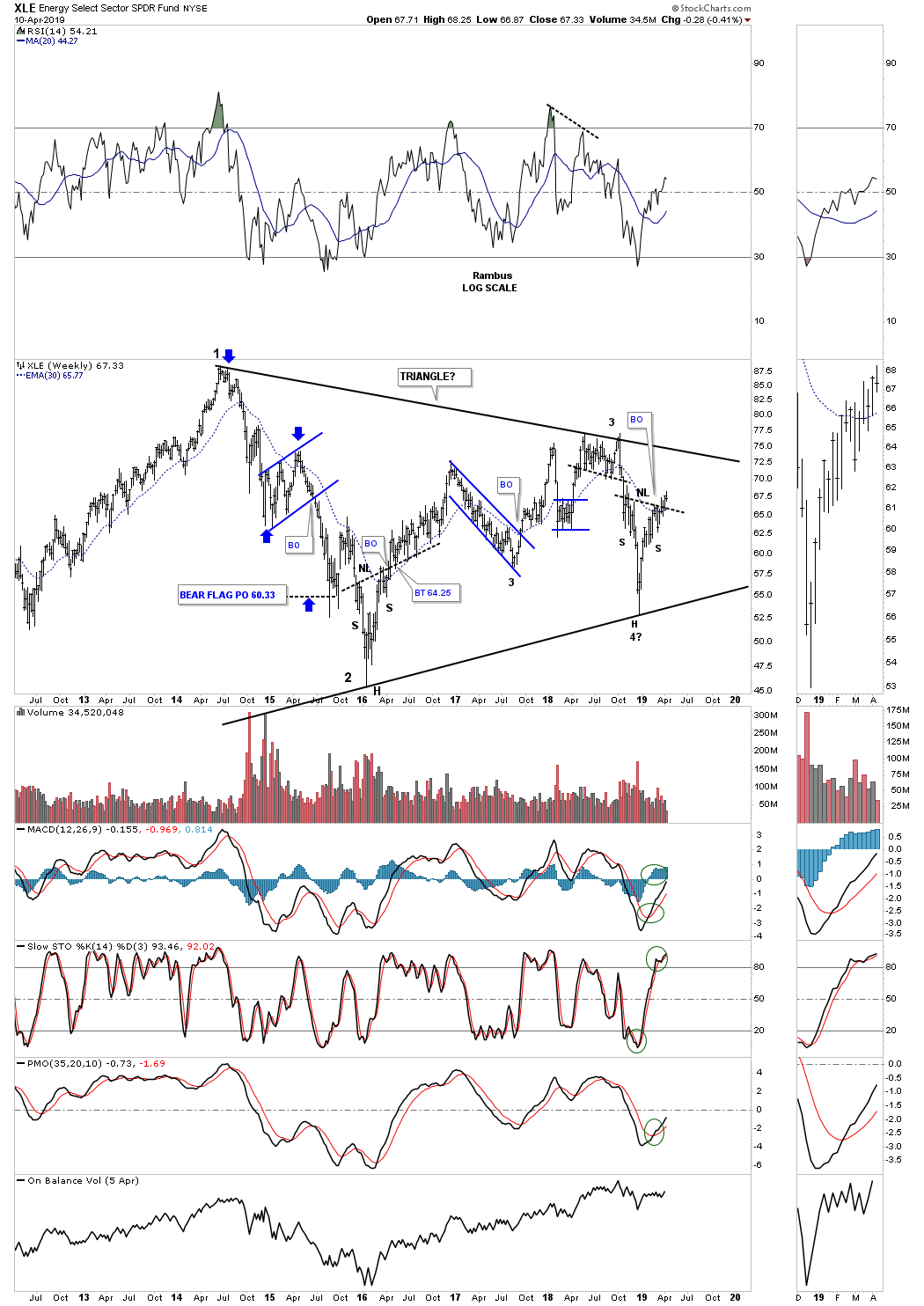
The monthly chart shows a potential large triangle consolidation pattern.
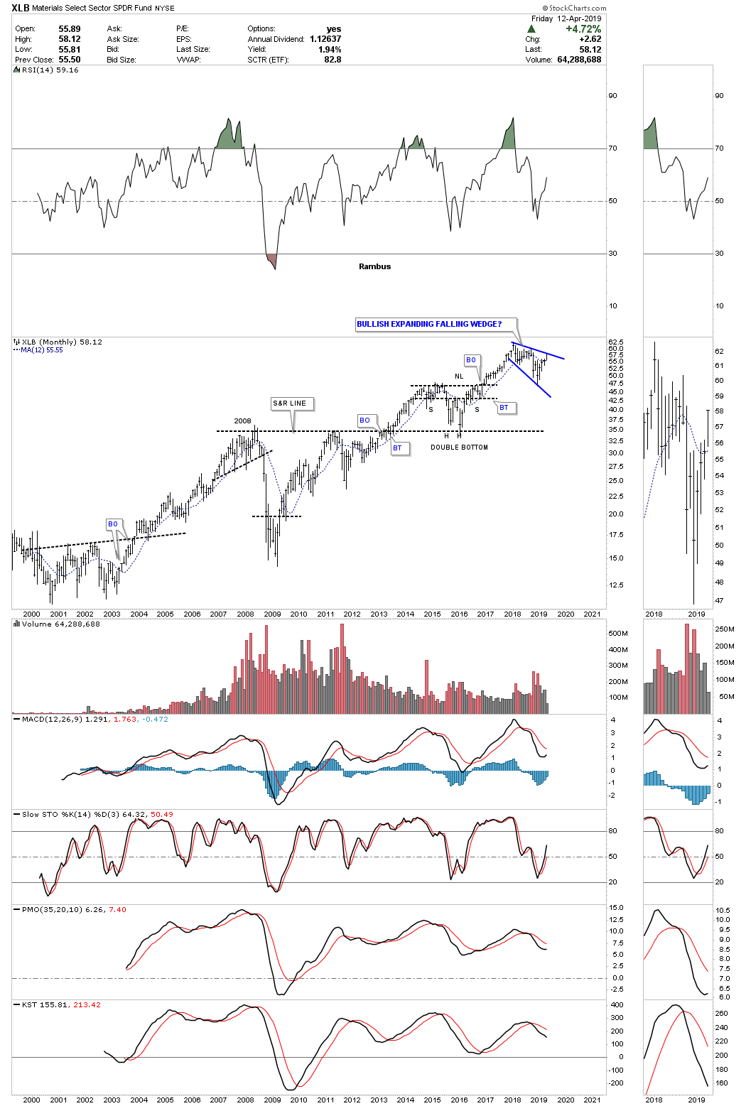
Below is another area that is looking bullish if it can breakout from its expanding falling wedge which is the XLB, basic materials fund. Right now it looks like it is going to do a ping pong move between the top rail of the expanding falling wedge and the neckline.
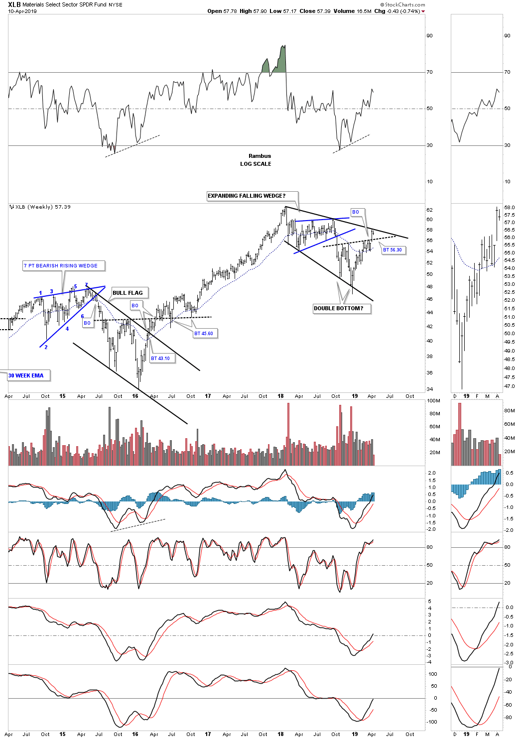
This long term monthly chart shows how the expanding falling wedge fits into the big picture. If the top rail of the expanding falling wedge gives way then we’ll see another impulse move higher.
I have more charts to add to this report in the coming days. All the best…Rambus
Quarterly Report Part 5… The Precious Metals Complex
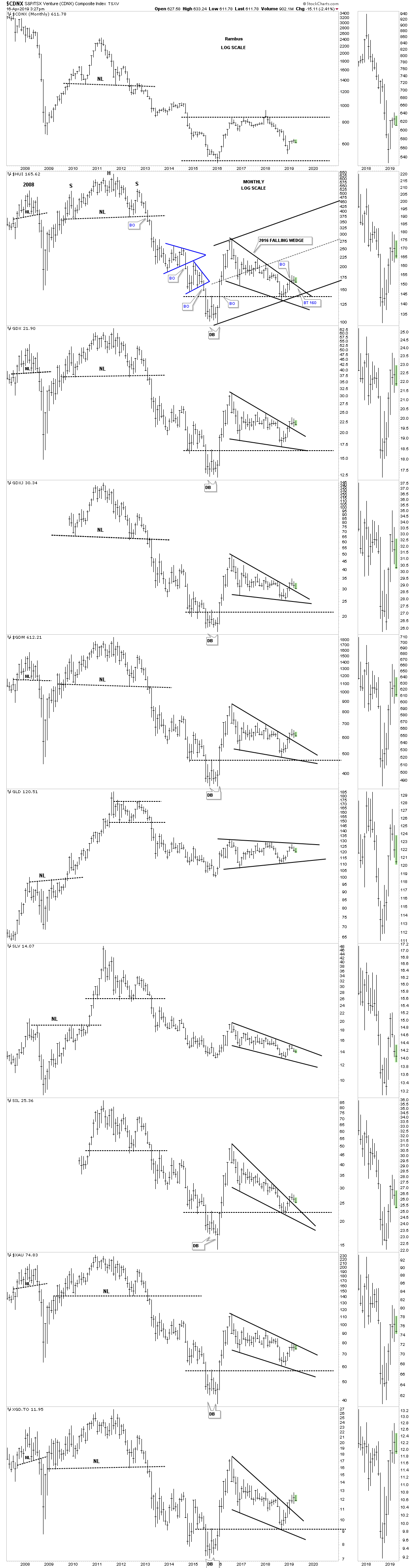
In this last part of the Quarterly Report we’ll look at the precious metals complex which has been driving the gold bugs crazy by showing some signs of life but not enough to call for a new bull market impulse leg since the 2011 high. It’s possible that the January 2016 low was the bear market low but to confirm that low we need to see the price action moving higher.
To show you what I mean below is a long term monthly look at gold which shows the 2013 massive H&S bottom. To confirm a new bull market is underway the price action is going to have to breakout above the neckline which comes into play around the 1350 area and until that happens the sideways chopping action will frustrate everyone that has been waiting so patiently for the new bull market to regain its footing. We are so close but yet so far away from the actual breakout.
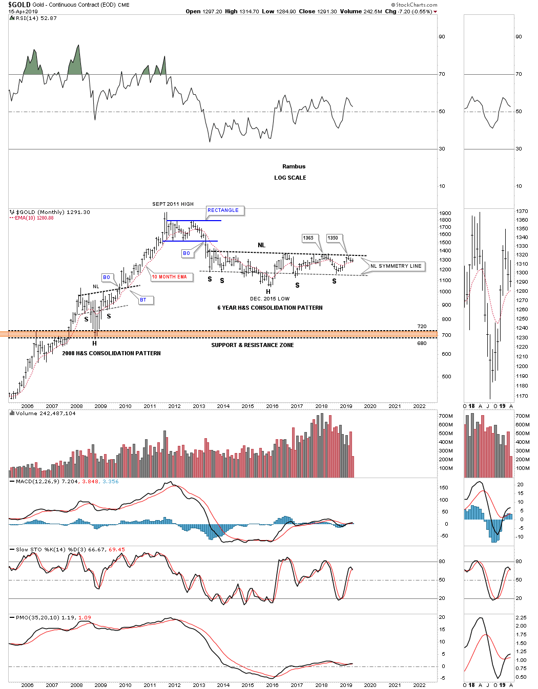
This next chart is another long term look at gold which shows its 2011 bear market downtrend channel which has kept the bulls in check. On a positive note gold broke out above the top rail and is now in backtest mode around the 1290 area. This backtesting has been going for close to three months now which is another reason that those that have invested in gold are getting so frustrated. To confirm the backtest is complete we’ll need to see gold make a new weekly high above the previous weekly high at 1350 which is where the 2013 neckline resides. To say 1350 is an important price point on these long term charts is an understatement.
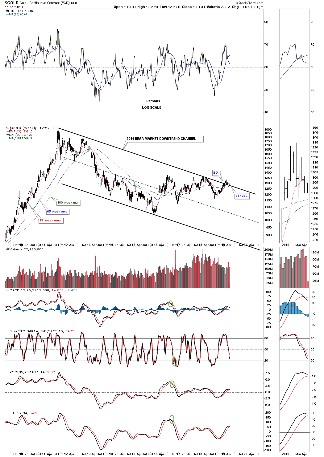
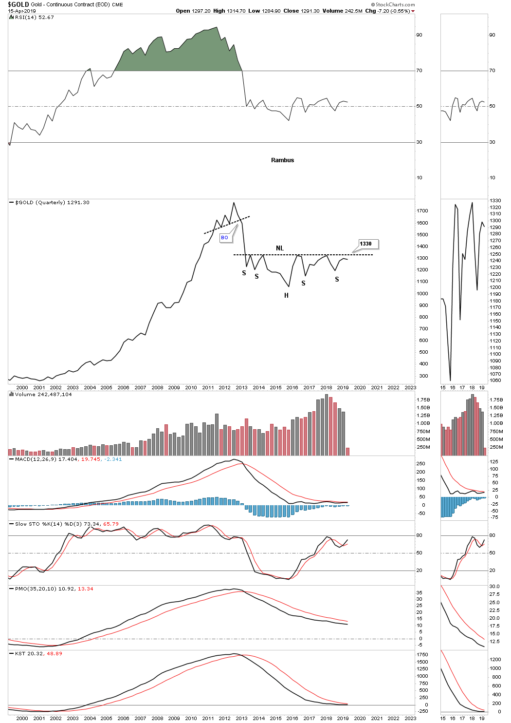
To really see the potential for our current 2013 H&S consolidation pattern we can look at the massive double bottom that formed in the late 1990’s and early 2000’s which launched gold’s ten year bull market. The height of that 2000 double bottom was 31% which is the exact same height as our current 2013 H&S bottom. Note all the work that needed to be done during the breaking out and backtesting process of the 2000’s double bottom before the bull market really took off. The odds are very high that when we finally get the breakout above the 2013 neckline we are going to see a similar breaking out and backtesting process to the 2000 double bottom before the next real impulse move up begins which will again be frustrating for the bulls.
This is how markets work and the bigger the chart pattern is the longer it takes for the breaking out and backtesting process to complete. Put yourself as a gold trade back at the 2000 double bottom formation to get a sense of the frustration the gold bulls felt back then. The price action bounced off the double bottom trendline seven months in a row before they were able to takeout the double bottom trendline. Then it took another five months to backtest the double bottom hump before the bull market finally was ready for showtime. For the gold bulls that had the patience and foritude to understand what was taking place, were richly reward in the end by a spectacular bull market that ran for ten years. The upside is that when all the work is done in regards to our current 2013 H&S consolidation pattern, you will know that the bull market will last for many years into the future punctuated by consolidation patterns from time to time.

Will we see a breakout above the neckline at the end of the second quarter? Note the 2000 to the 2011 bull market run that never made a lower low or lower high on this quarterly line chart until the 2011 top was put in.
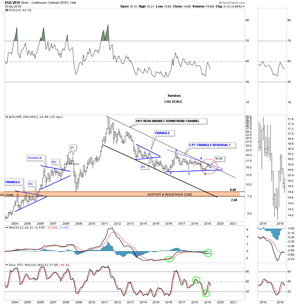
Lets now look at Silver which has been the weakest link within the PM complex. This weekly line chart shows silver forming its own 2016 falling wedge but has so far failed to breakout above the top rail like most of the PM stock indexes have already done. It’s currently in a ping pong move between the top rail of the 2016 falling wedge and the double bottom trendline at 14.75. There is also a potential very large three year double bottom that begins at the 2016 low.

This long term monthly chart for silver shows its 2011 bear market downtrend channel with the top rail still holding resistance. With this monthly chart I’m using the 2016 low as the starting point instead of the 2016 high on the weekly chart above, which shows a possible five point triangle reversal pattern if can ever takeout the top rail of the downtrend channel and the top rail of the triangle. This is the reality of what precious metals investors are dealing with right now.
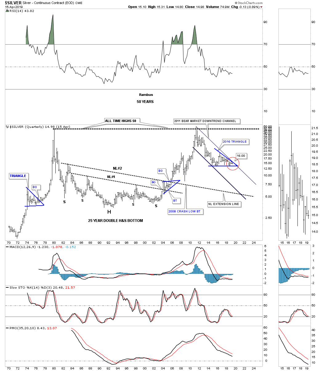
This last chart for silver is a long term 50 year quarterly chart which for me puts the current price action at a most critical long term inflection point. Always keeping an open mind to any eventuality you can see how the 2016 triangle fits into the very large picture. If silver fails to breakout above the top rail of the 2011 bear market downtrend channel and instead breaks below the 2016 low, bottom rail of the 2016 blue triangle, then things could get very ugly very fast. One doesn’t have to be a rocket scientist to see that the 2016 triangle would then become a halfway pattern to the downside. Note the blue triangle that formed at roughly the halfway point in silver’s massive rally that ended in 1980. This is only a possibility at this time and something to keep in the back of ones mind. The charts will let us know if it becomes reality.
Lets look at the GDX as a proxy for the big cap mining stocks that has been forming a possible 15 month H&S bottom with the right shoulder still under construction. It’s still possible the right shoulder is building out a triangle but it won’t be complete until the top rail is hit. The symmetry is there as long as the neckline symmetry line can hold support.
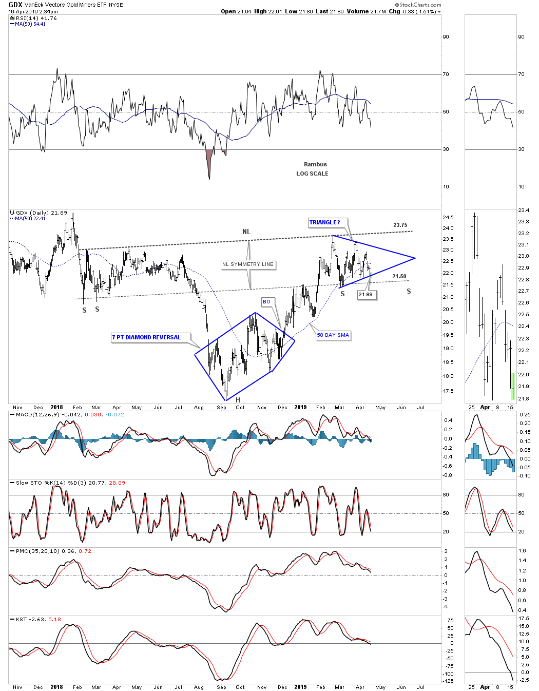
The GDX has a bigger pattern we’ve been following for a long time which is the 2016 falling wedge. At last years September low the GDX built out a seven point diamond reversal pattern at the fourth reversal point in the 2016 falling wedge. That led to the breakout above the top rail and a seven week backtest which was successful. The GDX then began to rally but before a real impulse leg up could being it started to buildout a small consolidation pattern which is the same one on the right shoulder on the H&S pattern above. So far the price action has been going as planned with the seven point diamond reversal pattern at the fourth reversal point in the 2016 falling wedge. The breakout of the blue diamond led to the breakout of the top rail of the 2016 falling wedge which was backtested for seven weeks and held support. The price action then began to move higher just as we had hoped and now it’s forming another small trading range which will hopefully breakout to the upside when it’s finished building out. So far nothing is broken on this weekly chart as long as the neckline symmetry line holds support.
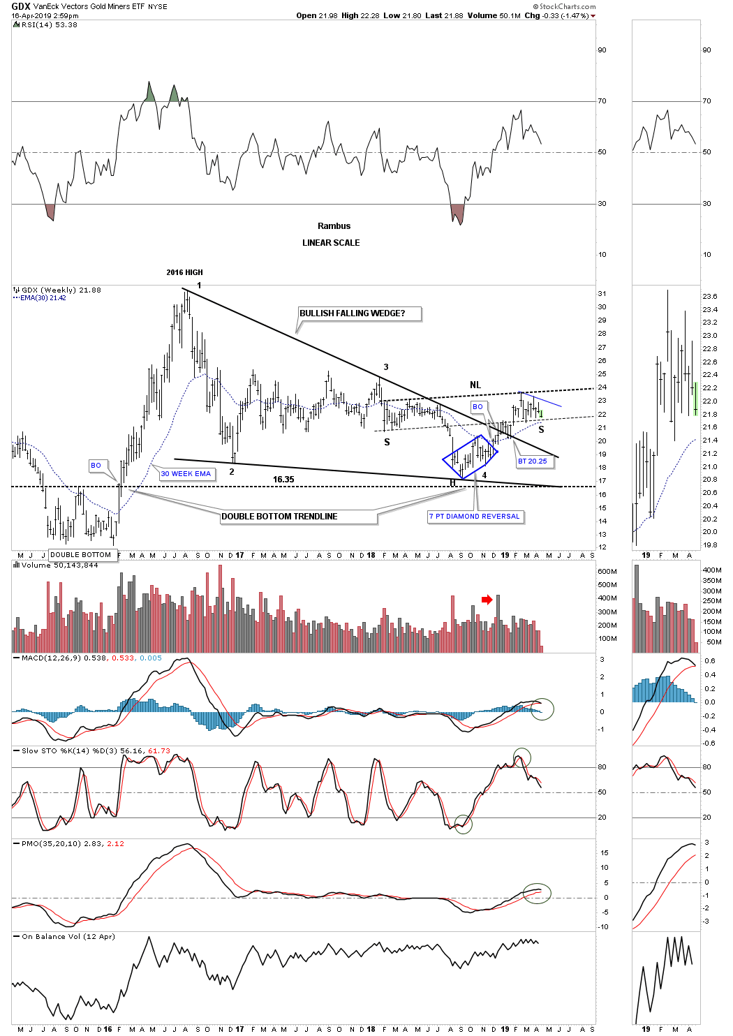
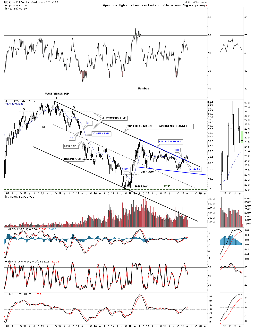
This next chart is a long term look at the GDX which goes back to its 2011 H&S top that began the bear market. The top rail of the downtrend channel was broken to the upside earlier this year and had a quick backtest. It’s possible we could have a second backtest which would come in around the 20.50 area which wouldn’t hurt the big picture. The top rail of the 2016 falling wedge and the top rail of the 2011 downtrend channel are one of the same.
I would like to finish up by showing you some PM combo charts which will give you a clear picture of where the precious metals complex is currently trading so you can see what needs to unfold to really get the next bull market underway.
This first combo chart is a weekly look at the PM complex which shows a pretty bullish setup if things can hold together. The two dominate chart patterns are the 2016 falling wedge with the H&S bottom forming hopefully part of the bottoming process. As you can see some of the indexes built out a small double bottom back in September of last year and need to hold support on the backtest. Several are being tested at this moment.
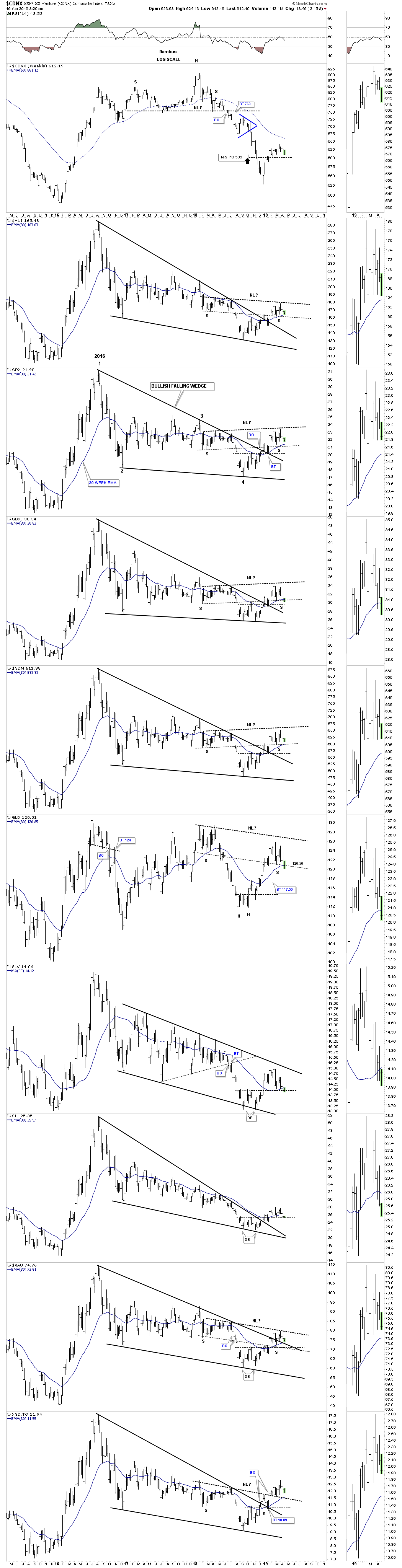
This weekly combo chart shows the double bottoms a little more clearly as shown by the green shaded areas.
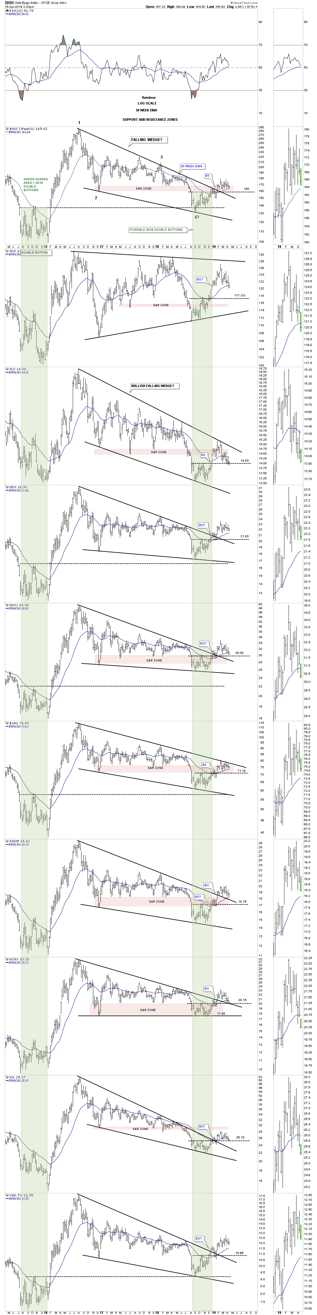
Below is a new combo chart I recently built which is a monthly chart that shows the 2011 H&S top and our current 2016 falling wedge. This monthly chart takes out much of the noise a daily chart can make as each bar makes up one month of trading. I’ve used up all the annotations so you can use the GDX chart as a proxy for the other PM indexes. As you can see we are now in the fourth month of breaking out above the top rail of the falling wedges. Again, it’s possible we could see a second backtest to the top rail to complete the backtest. Note how GLD and SLV have not broken out above their respective top trendlines yet.
When the PM complex is in a bull market the price action can be a sight to behold when they enter into an impulse move. This sector can also be psychologically challenging on ones emotions during major reversal points like the massive 2011 H&S top and possibly our current bottoming action. This sector isn’t for the faint of heart but if you understand how the PM complex works it can be very rewarding at times. It’s been almost eight years now since we had a good impulse move up except for the 2016 vertical move which burned itself out in eight months. Hopefully the top rail on these 2016 falling wedges are going to hold support and lead to the next impulse move higher that will knock our socks off. All the best…Rambus
Related Reading:
- Rambus: Blockbuster Chartology – January, 2019
- Rambus: Blockbuster Chartology – October, 2018
- Rambus: Blockbuster Chartology – July, 2018
- Rambus: Blockbuster Chartology – April, 2018
- 2017 Annual Wrap Up – Does Your Pension Fund Have A Deep State Drain? – January, 2018
- 1st Quarter Wrap Up 2018 Web Presentation
- Blockbuster Chartology with Rambus – October, 2017
- Blockbuster Chartology with Rambus – July, 2017
- Blockbuster Chartology with Rambus – May, 2017
- Blockbuster Chartology with Rambus – January, 2017
- Blockbuster Chartology with Rambus – October 20, 2016
- Blockbuster Chartology with Rambus – July 21, 2016
- Blockbuster Chartology with Rambus – April 21, 2016
- Rambus: Are We in a Deflationary Spiral? – January 28, 2016
- The Dollar, Gold & the S&P 500 with Rambus – October 15, 2015